| Image |
Comment |
| 07/24/2007 10:49:36 PM |
At One with the Seaby fotofanComment: Not sure if the choice of exposure was conscious here, but the hot spot in the upper right is pretty hard to get past. May as well have just jumped all the way in and gone for a complete silhouette of the girl (foregoing all detail on her) to bring the highlights of the scene undercontrol. If even possible. I think this might have just been an impossibly lit scene. |
 Photographer found comment helpful. Photographer found comment helpful. |
| 07/24/2007 10:46:38 PM |
Largamente by banmornComment: Meets challenge, lighting isn't bad, nicely focused. It's probably hard to find a novel approach to this sort of subject as its been done quite a lot, but this is pretty good. |
| Photographer found comment helpful. |
| 07/24/2007 10:45:34 PM |
Rhythm of the Waves.by slytennisComment: From the horizon up, this is a nice shot. Unfortunately what's below the horizon is the tie in to the challenge and there's some trouble there. Lots of overexposed spots on the waves, the big out of focus area in the foreground is disconcerting, and there's no strong presentation of wave like shapes themselves within the watery chaos. Do like those mountains though, and the sky is nicely captured as well. |
| Photographer found comment helpful. |
| 07/24/2007 10:43:47 PM |
Flavor by BugzeyeComment: Lighting is a bit harsh making all those little hotspots. Meets the challenge. Can't say I'm getting excited over it as it's been done with pencils and crayons and every other colorful thing, but this is ceratinly no worse than most of the other shots in this genre that I have seen before. |
| Photographer found comment helpful. |
| 07/24/2007 10:42:41 PM |
Stairway to the skyby ScapeshotsComment: First thing I notice about this shot is the tilt. When all you've got to show the class is two shades of horizontal lines, 'horizontal' is a very important thing in my mind. Other than that, meets the challenge but doesn't offer much beyond that I'm afraid. |
| Photographer found comment helpful. |
| 07/24/2007 10:41:06 PM |
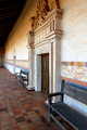
All Gone...by TiberiusComment: Not bad, not bad. Might work better with the first chair closer to the left edge of the frame, and what would be the harm in a smaller aperture giving my eyes the full line of chairs to feast upon in great detail? Like the tones here for some reason. Not usually a big fan of sepia but this is very appealing. |
| Photographer found comment helpful. |
| 07/24/2007 10:38:29 PM |
artificial rhythm \ natural rhythmby shoggyComment: This is quite nice but really begs to have a healthy dose of contrast added to provide some tonal separation. It's a bit washed out as is, which is a shame because this is a very appealing shot and fits the challenge well. |
| 07/24/2007 10:37:27 PM |
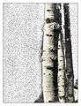
Eye see Treesby BlackboxComment: Don't care for the processing. Meets the challenge on a number of levels, but I just can't get past the effect. |
| Photographer found comment helpful. |
| 07/24/2007 10:36:41 PM |
shadow peopleby jdannelsComment: I like the idea, like the processing. Don't think you made the most of this though as the composition could use some work. Then again who has all day to sit around waiting for a crowd to fall into a pleasing formation by chance? Still, were the main pair a bit lower and to the left it might add a bit of balance, reduce the chaos, and anchor the shot. |
| Photographer found comment helpful. |
| 07/24/2007 10:35:13 PM |
Jesuit Rhythmby beamsclanComment: Nice scene with a lot of different rhythms contained within it. Might have cropped it so the wall vanishes at the left side of the frame rather than that little stub of the other wall showing, but that's just my opinion. |
| Photographer found comment helpful. |
Home -
Challenges -
Community -
League -
Photos -
Cameras -
Lenses -
Learn -
Help -
Terms of Use -
Privacy -
Top ^
DPChallenge, and website content and design, Copyright © 2001-2026 Challenging Technologies, LLC.
All digital photo copyrights belong to the photographers and may not be used without permission.
Current Server Time: 07/16/2026 06:47:35 PM EDT.