| Image |
Comment |
| 09/14/2007 12:14:46 PM |
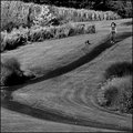
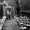
Arriving Somewhere But Not Hereby CorySmithComment: Critique Club feedback:
For a setup shot, you've shown a good eye for creating a scene that works well with the subject. Here the strong points of the image are the perspective of the street moving back to the horizon and centering the subject within those lines to make her pop out of the scene.
Things that likely held this back are the overall darkness of the image, the background clutter coming up from behind her head and a slightly soft focus on the subject.
If you have access to a flash, that would help light the subject so she stands out more while still allowing you to catch the soft morning light in the sky behind her. You could also take another stab at using various masks and other assorted digital wizardry in your image editor to see what could be done - but there is never a replacement for getting the lighting right 'in real life'.
Shooting the model from a lower point of view, or physically moving her forward to block the clutter coming up from her head would help as well. I would keep the centered placement, just find a spot that hides the light poles. Centered compositions are often panned, but think it works very well here.
Sharp focus is the bread and butter of scoring on DPC. This looks like a dimly lit scene so if you were on auto-focus, your camera might have been struggling to stay locked on. Manual focus may be your friend in a situation like this.
Overall, nice shot! |
 Photographer found comment helpful. Photographer found comment helpful. |
| 09/14/2007 12:07:50 PM |
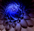
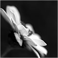
Glowby pixel_expressComment: Critique Club feedback:
This is an eye catching abstract with pleasing shapes and tones throughout the image.
Two things likely kept this shot from scoring higher. First, even sharpness throughout the shot would present all those wonderful patterns to the viewer in crisp detail. Second, the composition itself is rather haphazard. If this is a crop out of a larger shot, it may be worth experimenting to see where placing the 'focal point' (the blue bit) gives the image the most impact. In my mind I see that spot as being the upper right of the image so that the shapes and colors all point/fade down to the lower left.
Abstracts are not often appealing to DPC voters, and tend to get a love/hate response. The fact that this pulled a strong middle-of-the-road score should be taken as encouraging in my experience. |
| 09/14/2007 12:02:02 PM |
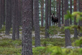
King of the forestby hajekaComment: Critique Club feedback:
You've captured a very nice wildlife scene here. The aperture selection works well to focus the eye onto the moose. The blurred out leaves in the foreground on the right side are a bit of a distraction, as they don't actually frame the subject and add no real interest to the overall shot.
Composition is well done, taking heed of the Rule of Thirds.
Free Studies tend to be very demanding in terms of delivering a heavy dose of glitz to the voter. While this image may pop a bit more with a tighter crop and playing with the contrast between subject and the rest of the scene, it's placement would likely not radically change compared to the rest of the entries in the challenge.
Nice work! |
| Photographer found comment helpful. |
| 09/13/2007 09:15:54 PM |
Day10.jpgby FotoMunkiComment: This is one of my Week 2 Merit Award selections. Really nice!
[thumb]583142[/thumb] |
| Photographer found comment helpful. |
| 09/13/2007 09:15:02 PM |
Day 11by PuckzzzComment: This is one of my Week 2 Merit Award selections. Great shot!
[thumb]583142[/thumb] |
| 09/13/2007 09:08:29 PM |
|
| Photographer found comment helpful. |
| 09/13/2007 09:08:03 PM |
|
| Photographer found comment helpful. |
| 09/13/2007 09:07:26 PM |
|
| Photographer found comment helpful. |
| 09/13/2007 08:49:43 PM |
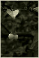
Day 13 - Intertwinedby BudyaComment: Very nice. I like this sort of eerie processing myself. Could maybe get those berries just a bit brighterto get them to pop off that lovely background. |
| Photographer found comment helpful. |
| 09/13/2007 08:48:57 PM |
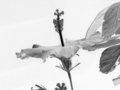
Hibiscus on Edgeby dtremainComment: There are aspects of this I like, but I think the composition/crop really keeps it from having the imapct it could. |
| Photographer found comment helpful. |
Home -
Challenges -
Community -
League -
Photos -
Cameras -
Lenses -
Learn -
Help -
Terms of Use -
Privacy -
Top ^
DPChallenge, and website content and design, Copyright © 2001-2026 Challenging Technologies, LLC.
All digital photo copyrights belong to the photographers and may not be used without permission.
Current Server Time: 06/24/2026 03:09:41 AM EDT.