| Image |
Comment |
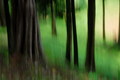
| 03/18/2008 10:34:18 PM |
Rainforestby alextktComment: This has such an amazing earthiness to it - fantastic, well-done abstraction. |
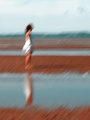
| 03/18/2008 10:33:24 PM |
Places In Betweenby rinacComment: Love this composition, how everything falls into neat divisions of color. Nice paint-stroke quality to this. 10 |
 Photographer found comment helpful. Photographer found comment helpful. |
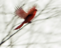
| 03/18/2008 10:32:33 PM |
Red Flightby JeniYComment: Nice stark contrasts, and capture of takeoff is blurred enough to convey the feeling of flight. Gets my top vote. |
| Photographer found comment helpful. |
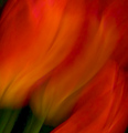
| 03/18/2008 10:30:49 PM |
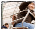
Bleur de lis by NeilComment: Gorgeous swirls of color, a very appealing blurry mess. Title is about as perfect as you can get! 10 |
| Photographer found comment helpful. |
| 03/11/2008 10:55:30 PM |
|
| Photographer found comment helpful. |
| 03/11/2008 10:52:21 PM |
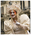
Hi!by MelethiaComment: This is fabulous, Deb - I think the transfer-like border goes well with this. |
| Photographer found comment helpful. |
| 03/08/2008 12:20:34 AM |
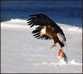
Not Without My Fishby basssman7Comment: Boy, all that snow acted as a great natural reflector, to light up his breast feathers! Stunning capture, Ernie - congrats! |
| Photographer found comment helpful. |
| 03/08/2008 12:04:39 AM |
|
| Photographer found comment helpful. |
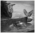
| 03/07/2008 11:45:58 PM |
Art Feeds Us...by pawdrixComment: To each his own - the fluttery bird *makes* the composition, for me. :) Square crop seems absolutely right for this composition, demands it even, which is more of a gut feeling - I couldn't tell you exactly why that is so. Again with this one, I find myself wishing for more contrast - you seem to have a lot of midtone range here and not so much highlights and shadows, which leaves the b/w treatment feeling a bit flat. Now this could very well be a matter of personal taste - I tend to favor strong contrasts in b/w images. |
| Photographer found comment helpful. |
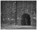
| 03/07/2008 11:38:48 PM |
Three Miceby pawdrixComment: All that wall height is well-chosen - if the shot were framed closer in, you would lose the "mousehole" sense. The graffiti and road markings keeps our eye line rooted to the level of the "mice", so we can't miss them. As a point of personal preference, I might make it more contrasty overall to see what that does for the image. |
| Photographer found comment helpful. |
Home -
Challenges -
Community -
League -
Photos -
Cameras -
Lenses -
Learn -
Help -
Terms of Use -
Privacy -
Top ^
DPChallenge, and website content and design, Copyright © 2001-2026 Challenging Technologies, LLC.
All digital photo copyrights belong to the photographers and may not be used without permission.
Current Server Time: 05/11/2026 08:35:32 AM EDT.