| Image |
Comment |
| 05/06/2007 03:55:28 AM |
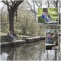
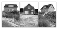
Day at the Parkby meyersComment: I really like the framing overall and I like how the background image is desaturated. As an experiment, try it with the insets zoomed in much more, so it's like looking through a magnifying glass. Use the large background pic to set the scene, and the insets to give us a more intimate look at them. Also, try two different shots showing them exploring, as opposed to a second shot of them sitting.
Basically, have fun with the format and introduce some variety. :) |
 Photographer found comment helpful. Photographer found comment helpful. |
| 05/06/2007 03:55:13 AM |
Sweet Serenityby libertyComment: Beautiful shot.
I think I'd like this a lot better without the picture showing through the boundaries. That would make it look like a three-panel wall hanging instead of a picture with some lines drawn on it. |
| Photographer found comment helpful. |
| 05/06/2007 03:54:56 AM |
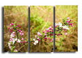
In the Gardenby jerseyjimComment: When splitting a single image up, try to make something interesting happen in each section so it tells a story or makes a comparison or something, as opposed to simply splitting the scene up. |
| 05/06/2007 03:54:39 AM |
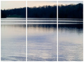
Glen Lakeby FrostyPawsComment: It's missing ... something. A boat? A bird? When splitting a single image up, try to make something interesting happen in each section so it tells a story or makes a comparison or something, as opposed to simply splitting the scene up. |
| Photographer found comment helpful. |
| 05/06/2007 03:54:33 AM |
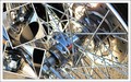
Harley Tripby naomikComment: It's a little too much chrome for me. It all kind of jumbles together, despite the inset boundaries. |
| Photographer found comment helpful. |
| 05/06/2007 03:53:37 AM |
|
| 05/06/2007 03:53:33 AM |
|
| Photographer found comment helpful. |
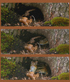
| 05/06/2007 03:53:17 AM |
Chipmuck's homeby ladpupmoeComment: Nice story here. I'd suggest increasing the contrast, though, on each picture. Make the chipmunk stand out, and darken the surrounding. |
| 05/06/2007 03:53:13 AM |
Footballby marvinComment: The framing seems accidental and distracts me; I'd prefer to see it as one solid vertical line. But I like the different placement of the ball in each shot. |
| Photographer found comment helpful. |
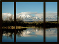
| 05/06/2007 03:52:57 AM |
Reflectionsby vtruanComment: What was your purpose in dividing this up this way? What does each piece show us? Why is this better than showing a single frame? It's a beautiful picture, but the triptych format isn't adding anything for me, and is definitely detracting (again, for me). |
| Photographer found comment helpful. |
Home -
Challenges -
Community -
League -
Photos -
Cameras -
Lenses -
Learn -
Help -
Terms of Use -
Privacy -
Top ^
DPChallenge, and website content and design, Copyright © 2001-2026 Challenging Technologies, LLC.
All digital photo copyrights belong to the photographers and may not be used without permission.
Current Server Time: 07/17/2026 03:15:39 AM EDT.