| Image |
Comment |
| 06/10/2007 10:30:48 PM |
Water Drops on Impatiensby mdhiesterComment: Sorry, but I'm not understanding what are your two similar subjects. Aside from that, the closer flower is pretty blurry, and the contrast is quite low. |
| 06/10/2007 10:29:35 PM |
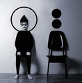
cinemaby silverfoxxComment: The most artistic shot I've seen yet. Silverfoxx? I just love the variations on theme here - how your body matches the chair's shape, the circles over the chair match your head's shape ... even the shadows are similar. |
 Photographer found comment helpful. Photographer found comment helpful. |
| 06/10/2007 10:25:56 PM |
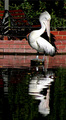
Look at meby emlbakerComment: I don't consider an object and its reflection to work for this challenge; I'm looking for two actual objects. |
| Photographer found comment helpful. |
| 06/10/2007 10:24:37 PM |
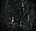
The Departedby LalliSigComment: Too processed for my taste, to the point I can barely find your other subject. |
| Photographer found comment helpful. |
| 06/10/2007 10:23:50 PM |
|
| Photographer found comment helpful. |
| 06/10/2007 10:23:26 PM |
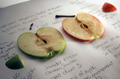
Buriedby karmatComment: Nice idea. Try boosting the contrast and get the white to really white, not gray. |
| Photographer found comment helpful. |
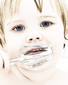
| 06/09/2007 09:41:17 PM |
A Beater of Whipped Creamby kashiComment: Well, Lea, are YOU happy with it? I think it's a pretty neat memory-keeper kind of shot. DPC doesn't reward different kinds of looks, so again, if you like, it, be happy. :) |
| Photographer found comment helpful. |
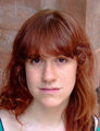
| 06/09/2007 06:36:50 PM |
Sallyby purpleflutterby13Comment: Like the other one, this is a good start. For a quick snapshot, this would be great as is.
If you want it to "pop," I agree with meyers - punch up the contrast a bit. Ever tried sharpening to increase contrast? Use a large radius, like 50, and a small amount, like 20 (leave threshhold at zero).
Also, as always, select the eyes and lips and sharpen a bit using normal settings (midrange amount, small radius) - try something like 50,1.5,0 AFTER resizing and go from there.
Finally, this is a great chance to play with the soft light layer you and I have discussed (we did, right?). With a very soft brush, select the background and darken it. I'd also reduce the saturation. You want her lovely red hair to stand out, and right now the background looks reddish, reducing the impact. Compare this shot to mine of my daugther's to see how you want contrasting colors:
 |
| Photographer found comment helpful. |
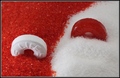
| 06/09/2007 06:32:12 PM |
Nickby purpleflutterby13Comment: Very nice shot. I would try three subtle changes and see whether you like it better:
1) Crop to just a little bit above the hat.
2) Select his eyes and from his mouth to his chin, and sharpen some more
3) Darken just a bit on his right cheek (image's left side) - not too much; it's fine to be bright than the other side.
This would be a great time to use my favorite trick of a soft light layer, but painted in black to darken instead of white to lighten. I'd bet you would need a pretty low opacity to make it look good. |
| Photographer found comment helpful. |
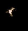
| 06/09/2007 06:27:49 PM |
untitledby krnodilComment: Yup, a very cool shot. Keep experimenting since you're getting results like this! |
| Photographer found comment helpful. |
Home -
Challenges -
Community -
League -
Photos -
Cameras -
Lenses -
Learn -
Help -
Terms of Use -
Privacy -
Top ^
DPChallenge, and website content and design, Copyright © 2001-2026 Challenging Technologies, LLC.
All digital photo copyrights belong to the photographers and may not be used without permission.
Current Server Time: 07/18/2026 04:20:42 PM EDT.