| Image |
Comment |
| 08/29/2007 01:28:17 AM |
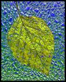
Falling to Earthby HipychikComment: So it's a stained-glass window? Something about it left me wondering. Very pretty colors and textures, and I like the angled composition.
Edited to add: Wow! Look at that average from your commenters. You certainly found your audience! :) Message edited by author 2007-08-29 01:28:50. |
 Photographer found comment helpful. Photographer found comment helpful. |
| 08/29/2007 01:26:58 AM |
Painted Ladyby raishComment: Pretty colors. Would've fit nicely into the blur side challenge, as the blur encourages me to expore the colors and shapes more than worry about sharp edges. |
| Photographer found comment helpful. |
| 08/29/2007 01:26:13 AM |
Three Pitchersby Bruce_the_RobertComment: Very nice composition, Rob! I also like the colors. Congrats on a new personal top 5! My only issue is the bright blob on the leftmost pitcher. Were you using your on-camera flash? |
| Photographer found comment helpful. |
| 08/29/2007 01:24:11 AM |
|
| Photographer found comment helpful. |
| 08/29/2007 01:23:11 AM |
Musicby JuliBocComment: Julianne, I voted this a 6 as a nice, pretty, peaceful scene with interesting colors and shapes. I encourage you to explore perspective correction tools if you have them available. In particular either skew or perspective could have straightened out the verticals on the left side. |
| Photographer found comment helpful. |
| 08/29/2007 01:21:45 AM |
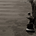
Spreading the Ashes - Goodbye Dadby BAMartinComment: Very emotional shot, Barbara. I think the composition hurt your score, though it was clear even during voting there was a story to be learned here. Putting the man and the box in opposite corners might have helped, along with getting the box a little away from the edge. That would make the space work as a separation, showing that the ashes have left the box and are now flying free in the world. As it is, the image feels unbalanced, with a whole lot of space on the left not really contributing to the story.
Edited to thank you for sharing your father's story. This is good example of an image that's much more powerful for knowing the background. DPC's competition format doesn't provide the opportunity for appreciating the moment as much as the photo all by itself. Message edited by author 2007-08-29 21:39:04. |
| Photographer found comment helpful. |
| 08/29/2007 01:19:02 AM |
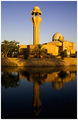
Mosqueby MelethiaComment: Congrats on the score, Deb - once again we're neighbors! :) My only nitpick was to think about cropping off some of the left side so the tower gets more out of the middle. It's kind of halfway out now, but that leaves composition uncomfortable to me. I realize that'd make it an even taller photo. |
| Photographer found comment helpful. |
| 08/29/2007 01:16:48 AM |
|
| Photographer found comment helpful. |
| 08/29/2007 01:01:03 AM |
|
| Photographer found comment helpful. |
| 08/29/2007 12:59:54 AM |
|
Home -
Challenges -
Community -
League -
Photos -
Cameras -
Lenses -
Learn -
Help -
Terms of Use -
Privacy -
Top ^
DPChallenge, and website content and design, Copyright © 2001-2026 Challenging Technologies, LLC.
All digital photo copyrights belong to the photographers and may not be used without permission.
Current Server Time: 06/25/2026 08:30:47 PM EDT.