| Image |
Comment |
| 09/08/2007 02:53:50 PM |
Homeby CorySmithComment: I like the photo and the sentiment a lot. However, the thing she's holding is so dark I can't identify it. |
 Photographer found comment helpful. Photographer found comment helpful. |
| 09/08/2007 02:38:49 PM |
Dance like no one is watchingby IronworkerComment: Yep - good advice. I like the whole phrase: work like you don't need the money, love like you've never been hurt, and dance like no one is watching.
Oh, and great pic to hold onto for you and her. :) |
| Photographer found comment helpful. |
| 09/08/2007 02:36:02 PM |
|
| Photographer found comment helpful. |
| 09/08/2007 02:35:15 PM |
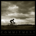
COMMITMENTby AlexSaberiComment: Nice shot, but be careful when going dark. On my calibrated CRT monitor, I can barely see the small text. |
| 09/08/2007 02:34:37 PM |
|
| Photographer found comment helpful. |
| 09/08/2007 02:32:30 PM |
Be Creativeby MelethiaComment: I wish I could vote on this Deb. Ha! I didn't notice that the rocks said "think" when we discussed it in the Critical Mass team thread. I hope it's getting appreciated! |
| Photographer found comment helpful. |
| 09/08/2007 12:36:15 PM |
Stillby KarenNfldComment: Very pretty shot. :) The crop doesn't bother me, but it does change it from a shot of a boat to a shot of a bright cheerful horizontal ... thing. |
| Photographer found comment helpful. |
| 09/08/2007 12:00:19 PM |
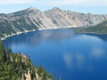
crater-lake.jpgby JerseyGenieComment: Ohhhh, yes. One of my favorite places on Earth. Nice capture of it! :) Try this to enhance contrast: use unsharp mask with settings of 20,50,0. Play around with the first two settings until you like it; each setting has a very different effect on the end result. It's remarkable how much pop it adds. |
| Photographer found comment helpful. |
| 09/08/2007 11:58:27 AM |
Ne 50/3by JerseyGenieComment: Jeanne, your eye for composition shows once again, and your focus control on this macros is very good. And the angles on the spools are definitely nice, as opposed to straight up and down.
I do have one composition suggestion: try moving the left edge in so it just touches the orange spool, filling the upper left corner with orange. That'll get the other end of that spool out of the middle and eliminate what my eye perceives as a big border to the left of the orange thread.
More importantly, I think, this lacks contrast. I bet that thread on the right is lot brighter than it looks here, for instance. You mentioned using levels. Experiment with really pushing the contrast to where it looks terrible, then back away, as opposed to slightly tapping it upward from where it starts. Play around - you never know what you might discover. :) |
| Photographer found comment helpful. |
| 09/08/2007 11:54:22 AM |
Why have you forgotten me?by JerseyGenieComment: Jeanne, the composition is very nice. This image lives and dies by the depth of detail, though, so the softness hurts the interest level. At least for me. This is where posthumous comes in behind me to say it's perfect as is. ;)
I also think that more contrast would benefit it. Learn how to use levels or curves to add contrast without blowing out the highlights. You usually want something to be pure white and pure black. Not always, but I think so in this shot. |
| Photographer found comment helpful. |
Home -
Challenges -
Community -
League -
Photos -
Cameras -
Lenses -
Learn -
Help -
Terms of Use -
Privacy -
Top ^
DPChallenge, and website content and design, Copyright © 2001-2026 Challenging Technologies, LLC.
All digital photo copyrights belong to the photographers and may not be used without permission.
Current Server Time: 06/25/2026 09:53:29 AM EDT.