| Image |
Comment |
| 03/08/2012 12:16:38 AM |
|
 Photographer found comment helpful. Photographer found comment helpful. |
| 03/06/2012 05:11:52 PM |
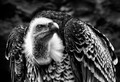
The Godfather  by wernerHComment: Originally posted by wernerH:
Originally posted by IreneM:
Your first portrait, your first ribbon and your new PB... I like both portraits but I prefer the lighting on the one you chose. Great work, Werner. |
Thank You very much! :) I tried to decipher "PB", but I can't think of anything. What does it mean? :) |
Personal Best. |
| Photographer found comment helpful. |
| 03/03/2012 10:47:10 PM |
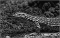
On the Huntby Gordon_1Comment: Great subject for a black and white. The tones are really nice and the background bokeh has some neat things happening. If you look hard there's a sheep directly above the curve of his back, heh. The composition seems fine.
What's hurting the image is that you can tell it's shot through a window or something, as there's some odd distortion. The focus also seems to be on the neck, and the eye is just a hair out of focus. That could be part of the distortion. |
| Photographer found comment helpful. |
| 02/27/2012 11:47:42 AM |
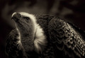
Watching by OzComment: Congratulations on your blue! It's a great subject for a black and white image.
...I still think your whites are blown. :)
|
| Photographer found comment helpful. |
| 02/15/2012 05:36:32 PM |
iPawd Musicby njsabsComment: I might have gone for a slightly different angle so that the cute pup has a body. Very nice otherwise. |
| Photographer found comment helpful. |
| 02/15/2012 05:34:05 PM |
Bleach Festival Music DPby BenstedComment: I can see desaturating the audience so the band is the focus. I can see desaturating the adults in the audience. What I can't understand is why you would desaturate the two most interesting parts of the photo and highlight two adults that while they look to be having a lot of fun aren't particularly interesting to me. |
| 02/15/2012 12:57:49 PM |
Isabellaby marvinComment: Lovely name, but unfortunately this image has a couple things on my "hate" list.
Negative filter: I just don't like them. Unless there's a clear reason for the image to be a negative it's amateurish. That sounds terrible, but it's true. It's probably one of the first things we all play with, and while it looks really cool on some images, I think part of our amazement of it is the color changes. It's not that it's really all that effective with the image.
Every day objects: I just don't like them. To me it's a sign of lack of effort and creativity.
I will say though that the composition is effective and I do like that. |
| 02/15/2012 12:44:03 PM |
Letter Oby whiterookComment: It looks like a snapshot of a sign that you shoehorned into the challenge. Sure it's the shape of an O, but if I wanted to I could find a bunch of other letters in the shot; none of which really seem intentional captures. |
| 02/15/2012 12:42:04 PM |
L.o.v.e.by bugababyComment: I clearly see how this fits the challenge, but I don't get the connection between love and gum. I suppose you could love gum...
I'm not a fan of everyday objects being photographed especially if they're commercial in nature. It just seems cheap. You need to watch your edges. Your focus is so much on the "LOVE" that you didn't catch there's something creeping in at the top right... or you hoped we wouldn't notice. Either way you need to catch stuff like that instantly during a shoot, move it, and take another shot.
The lighting is uninspired, but you didn't do a straight down shot, which is good. The angle you shot at grabs the viewer at the L and slides them down to the E. It's an effective composition. |
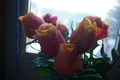
| 02/15/2012 12:31:54 PM |
RoseVby monkeypirateComment: I see the V.
Unfortunately, I also see a washed out image. It's nice that you used natural light, but one of the rules of thumb folks tell you is to put your back to the sun. Part of the reason for that is your lens will produce crisper, less washed out images. Obviously, rules are meant to be broken, but I don't see how breaking that rule helped you here.
Also there's some composition issues. While the flowers appear straight everything else in the image is tilted to the right. You can see it clearly in the window framing and also in the roof of the building outside. I'd also consider the blue cord "clutter" that doesn't add to the image, but instead distracts from the flowers. |
Home -
Challenges -
Community -
League -
Photos -
Cameras -
Lenses -
Learn -
Help -
Terms of Use -
Privacy -
Top ^
DPChallenge, and website content and design, Copyright © 2001-2026 Challenging Technologies, LLC.
All digital photo copyrights belong to the photographers and may not be used without permission.
Current Server Time: 07/17/2026 02:44:15 PM EDT.