| Image |
Comment |
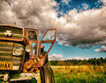
| 09/17/2014 01:45:50 PM |
sphinxby greslizzzComment: I like this, but I can't honestly say I feel it fits the challenge. Sure, there's right angles in there, but they all seem coincidental. |
 Photographer found comment helpful. Photographer found comment helpful. |
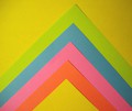
| 09/17/2014 01:44:24 PM |
Paper Right Anglesby ladpupmoeComment: Entries of paper really don't do anything for me. When I do see them in challenges, I expect damn near perfection, because really, you're just taking a straight on shot of paper on a table, ya know?
I like the shadows under the edges that show definition, but the overall lighting isn't even. The right side is much darker than the left side. Also, the composition is off center. The placement doesn't seem purposeful. I feel that it needs to be totally square and balanced or turned to one side enough to feel intentional. |
| Photographer found comment helpful. |
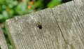
| 09/17/2014 01:39:38 PM |
Bumble Bee by whiterookComment: Gotta be honest, don't like the composition at all. The top of the board makes a nice leading line to the corner, but your poor bee is just plopped there in the middle. The bee isn't big enough or in enough focus to carry the weight of where he is. |
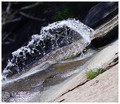
| 09/17/2014 01:37:42 PM |
Water Jet2by timbComment: It's a nice image, but I don't get "right angle" from it. |
| Photographer found comment helpful. |
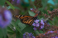
| 09/17/2014 01:36:51 PM |
Winging Itby KelliComment: The big blurry flower on the left needs to go away. It has a really strong presence in the photo, and detracts from the beautiful butterfly. Overall, I think the image is under exposed. I see the right angle in the wings though! |
| Photographer found comment helpful. |
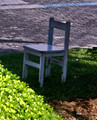
| 09/17/2014 01:35:14 PM |
Chairby MonaComment: Yup, it's a chair. Does this chair have a purpose? I can't see why you're showing me this photo of a chair in the shadows. The highlights of your bush on the lower left are also over exposed. |
| Photographer found comment helpful. |
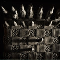
| 09/17/2014 01:33:40 PM |
Stuck in the Cornerby jarectorComment: The Photoshop filter doesn't do much to help here. It actually makes the pixel quality seem really bad, because I first saw the texture as color banding. |
| Photographer found comment helpful. |
| 09/17/2014 01:32:40 PM |
physiognomy studyby mariucaComment: I don't feel that the shapes are strong enough on their own to be a silhouette. Without the strong shapes, this just becomes an underexposed image. |
| Photographer found comment helpful. |
| 09/17/2014 01:31:27 PM |
|
| Photographer found comment helpful. |
| 09/17/2014 01:28:48 PM |
|
| Photographer found comment helpful. |
Home -
Challenges -
Community -
League -
Photos -
Cameras -
Lenses -
Learn -
Help -
Terms of Use -
Privacy -
Top ^
DPChallenge, and website content and design, Copyright © 2001-2026 Challenging Technologies, LLC.
All digital photo copyrights belong to the photographers and may not be used without permission.
Current Server Time: 06/26/2026 02:54:58 PM EDT.