| Image |
Comment |
| 11/11/2007 02:41:44 AM |
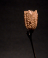
Podby glad2badadComment: I love the flower/pod texture, color, and lighting. I would have liked to see that accentuated more. The gradient background is also very nice. It adds a touch of class that may not have been achievable with a solid black.
The composition, however, feels a bit ackward. I understand that you were likely going for a minimalism look, but something just doesn't seem to flow. Maybe if the subject were along the left side of the frame? When I look at the subject I see calm, soothing, and pretty. The composition feels "interupted," because the subject is coming in from the right and almost feels like it's forcing its way into the middle. (I hope that makes sense!)
Overall, great subject. I'd love to see some different angles and tighter crops. |
 Photographer found comment helpful. Photographer found comment helpful. |
| 11/10/2007 08:52:28 PM |
|
| 11/10/2007 08:47:51 PM |
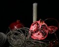
Pomegranatesby JLCComment: I don't understand the connection between, pomegranates, string, and candles. |
| Photographer found comment helpful. |
| 11/10/2007 08:33:50 PM |
Magic Takeoutby cannableComment: Without the title, I would have had no idea what this was.
I know it wouldn't make practical sense, but maybe some holes in the take-out box with the light shining through would have helped identify it. |
| Photographer found comment helpful. |
| 11/10/2007 08:30:54 PM |
|
| 11/10/2007 08:29:37 PM |
|
| Photographer found comment helpful. |
| 11/10/2007 08:23:48 PM |
Transparentby karenkComment: I like the idea, and your technique seems to have given you good results. However, the wall in the background looks like it's chopping her head off. Perhaps a solid color/texture wall would work better? |
| Photographer found comment helpful. |
| 11/10/2007 08:18:54 PM |
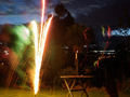
Junkby kyled93Comment: I have to point out the obvious... This is a "Single Light Source" challenge, and you have 5 light sources visible, and 2 that are right above you. |
| 11/10/2007 08:16:41 PM |
Unicornby gminkComment: This was probably a tough subject to shoot. Your whites are blown into a blob of white at the bottom, but if you had bumped up your shutter speed, you probably would have lost detail in the top of the unicorn.
While the colors are nice, and your subject is probably something very pretty to have in your house, it will not likely do well here in a photo. Photos of "stuff" generally don't score well.
We've all taken photos of "stuff" to work on technique, but generally it's not something you should enter into a photo contest. |
| Photographer found comment helpful. |
| 11/10/2007 08:06:17 PM |
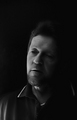
Bethany - The Goddaughterby SaswaaComment: There's a very large shadow behind your model. Don't be afraid to move your furniture further from the wall.
There's also no true blacks or whites in the photo, which is causing it to look very flat to me. I use Curves in Photoshop to make sure I have whites and blacks set to create the best depth. With this photo I used the black eyedropper in Curves to make the blacks blacker. Doing this made your subject pop right out of the background. |
| Photographer found comment helpful. |
Home -
Challenges -
Community -
League -
Photos -
Cameras -
Lenses -
Learn -
Help -
Terms of Use -
Privacy -
Top ^
DPChallenge, and website content and design, Copyright © 2001-2026 Challenging Technologies, LLC.
All digital photo copyrights belong to the photographers and may not be used without permission.
Current Server Time: 07/17/2026 07:11:30 PM EDT.