| Image |
Comment |
| 07/25/2008 03:39:55 PM |
Miller's Infernoby cptpolandComment: There's lots of seemingly cool things going on in this photo, but I don't know what to look at. I can't tell what the "Miller" object is. The reflection of the fire around the logo is pretty cool though, heh. |
 Photographer found comment helpful. Photographer found comment helpful. |
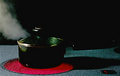
| 07/25/2008 03:31:56 PM |
A Watched Pot Boilsby CJinCAComment: Much of the pot gets lost against the black background. A second, dimmer light for the background would add some depth. Composition is a little tight too. |
| Photographer found comment helpful. |
| 07/23/2008 03:41:17 AM |
Simply Saladby TheresaAComment: It's interesting that this finished dead last. I think there's others that placed better that are far worse. Don't get me wrong, your focus was off, and it is a bit dark, but I can still see it hanging on a restaurant wall composition wise.
This is one of those images that makes you wonder about the psychology of DPC. Was it the technicals? Was it the abstractness? Was it simply that people didn't think that salad was a recipe worthy food? It's not THAT bad... weird.
|
| Photographer found comment helpful. |
| 07/21/2008 04:03:19 PM |
|
| Photographer found comment helpful. |
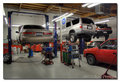
| 07/13/2008 04:13:37 PM |
ShopView1_800.jpgby BradComment: I'm sure it's perfectly safe to park cars under other cars, but if I were a customer and saw my car under another car, I'd have a mild stroke right there in your shop. |
| Photographer found comment helpful. |
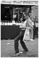
| 06/27/2008 05:42:31 AM |
Sexy Soulby pawdrixComment: Absolutely one of your best. It's so solidly put together, and makes you smile. The sign above puts the cherry on top. |
| Photographer found comment helpful. |
| 05/17/2008 05:32:25 AM |
Lady in Waiting by timfythetooComment: I'd have to say, you pretty much nailed this shot. Everything about her says soft, right down to her precious, pointed toes. |
| Photographer found comment helpful. |
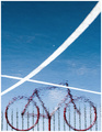
| 05/14/2008 05:00:32 AM |
Floating Bikeby h2Comment: This is awesome. You've got great leading lines, wonderful gradient colors, and great framing. Pretty darn unique if I do say so myself.
Pity this is Basic editing. I bet you would have loved to clone out that white spot in the middle and the one in the left corner. |
| Photographer found comment helpful. |
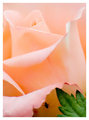
| 05/13/2008 03:28:46 PM |
Hidingby BudyaComment: I like that from the thumbnail you can't really see the bug. You say "Ooo.. pretty flower... AHH!.. bug..." At least I did. Basically I like that you shot the flower as if the bug weren't there. The bug is a subtle surprise. |
| Photographer found comment helpful. |
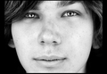
| 05/08/2008 04:46:30 PM |
Prospectsby LanndonKaneComment: Originally posted by trevytrev:
This is a nice shot and the eyes are well done. Compositionally i feel the eyes are too far up in the frame which I feel results in making the nose the focus in the photo when it should be the beautfil eyes. I will agree that the think borders on the sides don't do much for this shot either and if you were going to use a border I might have used a thick one on top and bottom to give this a more cinamatic feel. I didn't vote but I would have given this a 6 or 7. |
Very good point about the eyes being high up in the frame and the nose being centered. |
| Photographer found comment helpful. |
Home -
Challenges -
Community -
League -
Photos -
Cameras -
Lenses -
Learn -
Help -
Terms of Use -
Privacy -
Top ^
DPChallenge, and website content and design, Copyright © 2001-2026 Challenging Technologies, LLC.
All digital photo copyrights belong to the photographers and may not be used without permission.
Current Server Time: 07/17/2026 01:37:50 PM EDT.