| Image |
Comment |
| 08/02/2008 02:43:53 AM |
|
 Photographer found comment helpful. Photographer found comment helpful. |
| 08/01/2008 05:20:01 AM |
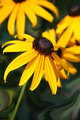
Coneflowerby FrostyPawsComment: I love the light tips of the petals. I think the center of the flower gets lost in the shadows and that throws the balance off on the photo. A quick and dirty dodging of the center would brighten that right up.
The green in the background draws your eye away from the flower also. For me it almost flattens the image, because the green is coming forward and fighting for attention. If you desaturate the greens a bit you keep the interesting textures while allowing the flower to be the star. |
| 08/01/2008 05:09:52 AM |
|
| Photographer found comment helpful. |
| 08/01/2008 05:07:54 AM |
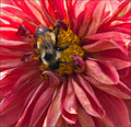
Bee & Petalsby KelliComment: Why must critters that look so cute and fluffy be so mean?? I want to snuggle with that little guy, but I bet he wouldn't like that.
Your focus is a bit off, and it would be nice if he was more illuminated by the sun or a flash. I can completely understand why you didn't want to position the flower to get more light on him though, heh. |
| Photographer found comment helpful. |
| 08/01/2008 04:47:47 AM |
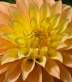
Dahlia-Detailby sfaliceComment: This shot is begging for a square crop to me, mainly to get rid of the top bit that doesn't do much for the whole... and black and white, but that could just be a personal phase. The accentuated edges make it look like a pastel painting. |
| Photographer found comment helpful. |
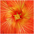
| 08/01/2008 04:38:19 AM |
ORANGE - Day 1by sherpetComment: This is almost hypnotizing the way the petals gently curve around. It really pulls you into the center.
The reds seemed a bit over-saturated to me, so I tested turning the saturation down a bit in Photoshop via Hue/Saturation. I didn't like the outcome, but then just turned the brightness down (a lot!) on the red level with the same tool. It looks like a pit of fire! Your version is much happier.
 Message edited by author 2008-08-01 04:39:01. Message edited by author 2008-08-01 04:39:01. |
| Photographer found comment helpful. |
| 08/01/2008 04:27:05 AM |
|
| Photographer found comment helpful. |
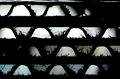
| 07/28/2008 12:25:27 AM |
Lit From Behindby LadyKComment: Great idea. The different fibers look so cool. The colors almost make it look like stained glass. The photo as a whole lacks something, but I can't put my finger on it.
Still, a very cool abstract. |
| Photographer found comment helpful. |
| 07/27/2008 03:41:03 PM |
I Walk Because I Cannot Flyby colorcarnivalComment: The processing looks a bit off, but holy emotion. I almost cried reading the title. I love the black and white choice, and I actually don't mind that he's headless. I think if he had a head, the wing would be less noticeable. The power of this image relies heavily on the viewer noticing the broken wing.
As for the processing, it looks like maybe the bird itself was maybe out of focus and in turn you over sharpened it trying to bring it in? The goose has a slight halo glow. Maybe this is a small crop from a larger image, and its lost some detail.
Meh, I still love the shot! |
| Photographer found comment helpful. |
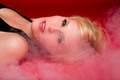
| 07/25/2008 03:49:43 PM |
Woman on fireby biggisComment: I can't believe I'm saying this...
More cleavage... Something about the cleavage being cut off there makes me want to push the left edge of the frame aside. I think the crop is just too tight.
I like the overall colors and the smoke, but it got me wondering how people get their smoke to be whiter. Yours is a bit gray. I'm sure you can adjust it using Selective Color and adjusting the grays, but in basic you'd probably screw up a bunch of other colors. Even in advanced it would be hard. Hmmm |
| Photographer found comment helpful. |
Home -
Challenges -
Community -
League -
Photos -
Cameras -
Lenses -
Learn -
Help -
Terms of Use -
Privacy -
Top ^
DPChallenge, and website content and design, Copyright © 2001-2026 Challenging Technologies, LLC.
All digital photo copyrights belong to the photographers and may not be used without permission.
Current Server Time: 07/17/2026 10:06:10 PM EDT.