|
|
|
Showing 711 - 720 of ~8163 |
| Image |
Comment |
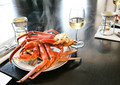
| 07/29/2016 08:40:38 PM | Greek Island Travelby docjonnyComment: Greetings from the Critique Club!
I really liked this shot, I gave it a 7 in voting :-) Very simple layout, the white sans-serif font works well, the message is quite simple and there. The photo of Mykonos is straightforward tourist-destination fodder, but it does the job and the blue water of the pool plays of well against the ocean and the sky.
The one thing I don't like are the utility poles about halfway up the image. They and the wires hanging off of them are dark and thus stand out in contrast to the nice lines, white houses and blues in the picture.
To be really nitpicky, I would suggest using the Rulers tool to help align the type a bit better...there is a gutter of blank space on the title, but the crossbar on the 't' of the word 'travel' is flush left against the side of the image. You need to leave a gutter of room there too.
Otherwise, your settings make perfect sense as you shot handheld and when the light was quite high in the sky. Not too much saturation or colour hit, just enough to make everything pop nicely.
Hope this helps!
Susan |  Photographer found comment helpful. Photographer found comment helpful. |
| 07/26/2016 10:53:43 PM | | | Photographer found comment helpful. |
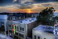
| 07/25/2016 10:10:05 PM | Downtown Sunsetby WonderDudeComment: Greetings from the Critique Club!
Ouch, coming in 2nd from last...been there, done that, not much fun. I think in this instance you may not have realize what 'painting with light' is, and when you look at the homepage you realize it's the controlled use of light to enhance a subject, whether it is with a flashlight or tiny LEDs.
Still this is quite a good cityscape-at-sunset shot, and I do find my eye going from the neon sign to the tree on the right and then up to the setting sun. It has a dreamy feel to it, but sadly not a painted light feel :-/ This is one of those learning-curve challenges, so hopefully next time a painted light challenge is announced you have an idea as to what to shoot for.
Hope this helps, please keep shooting and entering!
Susan | | Photographer found comment helpful. |
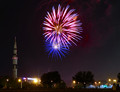
| 07/25/2016 09:59:34 PM | Fireworks At The Space Museum by WonderDudeComment: Greetings from the Critique Club!
Daniel, my most sincere apologies for not congratulting you sooner on this shot - and your first ribbon to boot! Very well caught, great comp, even the lights at the bottom don't beat out the fireworks for attention. The rocket draws it all together and you got nice colour drift to the right of the fireworks, and of course the iconic red/white/blue.
Now just go out there and keep shooting and entering challenges, glad to see you doing so well!
((hugs)) Susan | | Photographer found comment helpful. |
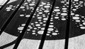
| 07/25/2016 09:48:53 PM | Sunlight on the deckby docjonnyComment: Greetings from the Critique Club!
I can see you took the description of the challenge to heart, and did a wonderful job of capturing lines and circles in the technical sense. Great lighting, I love the b/w conversion cause then colour does not distract you. I think the main problem here is, too much of a good thing...the pattern is quite random and the image large, so the eye roves looking for a focal point, and there isn't one.
If, however, you crop in a bit to the middle third, you can see the bars emerging as leading lines leading up to the bursts of circles. The ridged floor upon which the circles fall means that you could crop in really close, with perhaps just one bar of shadow, and use that as a focal point and let the circles on either side dance around like fizzy bubbles around a swizzle stick :-)
hope this helps, please keep shooting and entering!
Susan | | Photographer found comment helpful. |
| 07/23/2016 09:17:31 AM | | | Photographer found comment helpful. |
| 07/20/2016 08:57:34 PM | Meby JudiComment: maple leaves in OZ? I don't think so. |
| 07/20/2016 04:22:44 PM | | | Photographer found comment helpful. |
| 07/13/2016 07:55:41 PM | p u r e • c h a o sby Ja-9Comment: Greetings from the Critique Club!
Congrats on the top ten finish, Janine!
Nice blend of colours, I can only imagine that you and/or helpers were grabbing coloured LEDs and having fun making short sharp moves with them. Simple and effective. The red curves pin the eye, which is then free to wander over the rest of the image and enjoy it.
Keep up the good work!
Susan | | Photographer found comment helpful. |
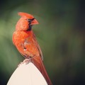
| 07/13/2016 07:52:38 PM | Wild and Free.by RulerZigzagComment: Greetings from the Critique Club!
Wow, he looks so much like the guy I called Big Red, who lived around my house some 5 years ago...now he looked like he could rip your finger off, and not mind doing so :-)
Nice shot of the cardinal but whatever that big white thing (feeder?) he is perched on just fights him for all the attention. Red, white and black are the three colours that extras in films and movies are told to avoid bringing to set (unless specifically told to do so or as outfitted by Wardrobe) as they are all colours that grab the eye. Here you have two of those colours, in approximately equal doses and on the same side of the shot...you can see where things are going. If you have a dark or neutral coloured object for him to perch on, so his redness pops in the shot, then half the battle is won.
Feel free to PM me
Susan | | Photographer found comment helpful. |
|
Showing 711 - 720 of ~8163 |
Home -
Challenges -
Community -
League -
Photos -
Cameras -
Lenses -
Learn -
Help -
Terms of Use -
Privacy -
Top ^
DPChallenge, and website content and design, Copyright © 2001-2026 Challenging Technologies, LLC.
All digital photo copyrights belong to the photographers and may not be used without permission.
Current Server Time: 07/24/2026 05:20:59 AM EDT.
|