|
|
|
Showing 3931 - 3940 of ~8163 |
| Image |
Comment |
| 04/23/2009 02:26:56 PM | Tacked down by IreneMComment: Dolphin...oh yes I see it too...way to go, O Queen of the Macros! |  Photographer found comment helpful. Photographer found comment helpful. |
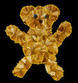
| 04/23/2009 12:32:04 PM | Teddy Boy- 50's Throw-backby wingyisleedsComment: Greetings from the Critique Club!
Initial reaction: Got a chuckle from me as I watched it load and was thinking, 'OMG, that's very funny, very creative, and that took a lot of work'...especially as there are absolutely no stray shreds! I can only imagine how many #2 pencils you went through.
Technical: Compositionally a very centred, dead-on shot, but very clean and I do strongly believe in the KISS principle. Considering the medium you were working with, you could hardly be expected to do an extreme pov. The features made of pencil stubs, esp the blue eyes, make a great focal point. Not too much lighting, nor too little, just right :-) The natural variation in the shavings adds dof and interest and does create a patchwork effect. Black background helps keeps things simple and doesn't detract.
Artistic: Got a great response on that front, as can be seen from the comments and your final score, and small wonder! I'm always glad to see people appreciating a lot of work has gone into a shot. The yellow edging works beautifully to outline the bear and its body shape. There is a sense of liveliness and mischief to the bear, like he's about to run off and get into trouble.
Overall a very sweet, fun character and very strong execution. Good work!
Feel free to PM me with any questions.
Susan | | Photographer found comment helpful. |
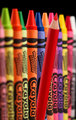
| 04/23/2009 01:46:14 AM | A Different Colorby shadowdoc31Comment: Greetings from the Criticque Club!
Initial impression: Very colourful eye-candy macro, lots of fun to look at.
Technical: Very good lighting, razor-sharp focus where it's needed, composition is good but not outstanding, the askew pencil adds interest. The amount of pp seems to be just right for this shot.
Artistic: I'd like to see some variation in the height of the crayons to add interest, especially as there is a nice pattern with the lettering on the out-of-focus crayons. The tops of the crayons and pencil are all pristine, which is fine, but create an almost stiflyingly flat horizon.
Just an aside from someone who worked in Advertising for several years...I would be very cautious in trying to re-create any ad unless your version blows the original out of the water!
Overall, good work, you have the technical basics in place, I'd like to see a little more adventurousness.
If you have any questions please feel free to PM me.
Susan |
| 04/23/2009 01:24:58 AM | Iron Horseby rodfulkComment: Greetings from the Criticque Club!
Initial impression: As mentioned in my earlier comment, I love these old trains and I like the sepia. I find this shot to be very atmospheric and evocative of the time that these trains ran the rails.
Technical: I like the composition here as it helps show off the immensity and solidity of the engine. Good dof and I am a fan of this kind of pov. Looks like it was shot on a slightly overcast day as there aren't any telltale areas of glare on the metal. Light in upper left borders on being flat, but isn't, so good that there is a softness there to contrast with the engine.
Artistic: Very good choice of pof, but the crop is a bit tight. I'd like to see more room in front of the train, so there is a sense of a place for it to go. Also, would like to see either the top of the cab, or all of the wheels, just to further enhance the scale.
The pp is quite pleasing, and very clever idea to use the sepia tint to help hide the Christmas lights! One trick I learned here on dpc is to do all your image adjustment work first, then resize, usm, and save for web.
All in all, still very much one of my favourite shots from that challenge, and I am glad I got the chance to criticque it.
Feel free to PM me any questions you may have.
Susan | | Photographer found comment helpful. |
| 04/23/2009 12:47:56 AM | My Loveby QuigleyComment: *waving* Hi Mrs Quigley! Lovely shot, and yes I do agree you look wayyy too young to be keeping Max in line, good for you! :-)
PS love the jacket! | | Photographer found comment helpful. |
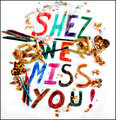
| 04/23/2009 12:43:35 AM | Come Back Soonby QuigleyComment: Wonderful tribute, Max, says in one photo what all of us here on dpc are thinking. And congrats on the placing, too! | | Photographer found comment helpful. |
| 04/22/2009 01:08:25 AM | Classicolor Loveby JimiRoseComment: Greetings from the Critique Club!
Initial impression: I enjoy looking at this shot. The composition is pleasing, the colours are saturated but not overdone. I can see why some aren't crazy about the brand name on the pencils, but I find the eye does start looking for it and does create some flow. Had I voted I would have given this a 6.
Technical: I would try to get more light from the left, either with a reflector or second light. I'd like to see more dof too to include the points forming the upper right curve of the heart. ISO seems a little high for a still life.
Artistic: That white pencil does detract because it's right between the black, which is oof, and the chartreuse, which is in focus. I think without the black and white you could've made a smaller, tighter shape.
If you have any questions please feel free to PM me.
Susan | | Photographer found comment helpful. |
| 04/22/2009 12:25:22 AM | Floralby SoulComment: Greetings from the Critique Club!
Initial reaction: I appreciate the effort behind this shot, looks like some of my earliest attempts here! There is a good effort at composition; you are using the rule of thirds, and there are some leading lines with the lower part of the pattern. Most of the right could be cropped out. Picture needs more of a focal point and a little more zing to it. I would have liked to see this in colour, and maxed out in terms of size.
Technical: I have the same lens that you used here so I know how much it can be pushed into drawing out detail! With an aperture of 5.3 you should be able to get all of the foreground and most of the background in focus. The lighting is flat and the b/w treatment only accentuates this aspect. 1/125 seems awfully fast, too; anywhere from 1/60 to 1/20 would probably have been enough. Try lighting from the side; you can make a rudimentary reflector from aluminum foil taped to a sheet of strong cardboard. You can then bounce the light off the reflector onto the area you want to highlight.
Artistic: The surface of the fabric is a little too flat. Try rumpling it up or put something underneath the fabric to show off the texture; that would also add more dof and interest to the shot.
Final thoughts: A good attempt. Get to know your camera and just as importantly, your lens' capability. Keep shooting!
If you have any questions feel free to PM me.
Susan Message edited by author 2009-04-22 00:29:05. |
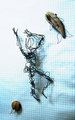
| 04/20/2009 01:01:46 PM | Drowningby posthumousComment: wow what a simple but effective use of graph paper, wire and the rotate tool! 7 | | Photographer found comment helpful. |
| 04/20/2009 01:01:00 PM | One Night Stabby jellyooooComment: good idea and I like the angles, setup etc, but I think the shot would've been better if she'd been wearing a short dress rather than nude; just seems too blatant. (Could've been a plastic sheet even, to help keep the blood off :-) | | Photographer found comment helpful. |
|
Showing 3931 - 3940 of ~8163 |
Home -
Challenges -
Community -
League -
Photos -
Cameras -
Lenses -
Learn -
Help -
Terms of Use -
Privacy -
Top ^
DPChallenge, and website content and design, Copyright © 2001-2026 Challenging Technologies, LLC.
All digital photo copyrights belong to the photographers and may not be used without permission.
Current Server Time: 06/20/2026 02:55:16 PM EDT.
|