|
|
|
Showing 381 - 390 of ~8163 |
| Image |
Comment |
| 06/12/2017 06:58:38 PM | |  Photographer found comment helpful. Photographer found comment helpful. |
| 06/10/2017 06:25:47 PM | | | Photographer found comment helpful. |
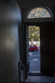
| 06/10/2017 06:18:53 PM | glimpse of the outside world by gingerphotographerComment: Greetings from the Critique Club.
Rory, I am afraid that you need to learn a few hard lessons about photography. I can see that you have tried to add some interest with your composition, and the red of the car pops nicely against the blues in the image. But in terms of showing us what season it is, it simply falls flat. There is nothing here that meets the challenge requirements. If your school has a photography club, you may want to join, or hunt down the nearest visual arts teacher and get them to tutor you in basic composition, flow, lighting etc.
Sorry I can't say much else about this image. Please take my advice to heart and learn now while you can.
Susan |
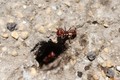
| 06/10/2017 06:14:28 PM | Anyone Home?by KatPsenComment: Greetings from the Critique Club.
All right...ants are not domesticated critters, so technically this is a wildlife shot. But it simply isn't a strong entry, and here's why: it's a rather boring shot of an ant poised above the entrance to its nest, shot from overhead. I believe harvester ants are a good size, so why not get down to its level or even below it, and shoot up to make the ant look huge and imposing? Doing so may well have helped improve this image's chances tremendously.
In terms of composition, the lighting is flat and washy (why such a high ISO and fast shutter speed? both nullify the deep dof) the out-of-focus nest entryway doesn't give us much to look at apart from a blurry ant body.The main ant is in focus but that's about it.
All I can really do to suggest improving on shots like these, if ants are going to be *your thing*....go out there every single day and take 500 pics of those ants...and make sure every single one is different. Not just in number of ants but changes in composition, lighting, angle, lens which you use, anything and everything.
Hope this critique has been of help. Feel free to PM me. Susan. |
| 06/08/2017 09:57:27 PM | Sunsetby kaiyangComment: Greetings from the Critique Club!
An interesting pic, showing the fun intimacy of a family having fun on a very interesting piece of architecture. However, the left side of the pic is a nice sunset over a city, and it competes with the family/bridge...in fact, even your title draws attention more to the sunset than the family. Hence, they cancel each other out as the eye is continually roving between the two sides, and finding no rest in either. Hence the high number of low scores. Also, there is far too much post-processing work going on in the colour department. It doesn't look real, and anything here that looks fake (especially in Free Studies, where competition is already very tough and you are expected to enter your very best work from that month) will get voted down. I suggest focusing more on the composition and less on the post-processing!
Feel free to PM me with any comments or questions,
Susan | | Photographer found comment helpful. |
| 06/08/2017 09:46:50 PM | Spring fever!by RulerZigzagComment: Greetings from the Critique Club!
A nice portrait of a pretty girl but I feel the composition is quite distracting - subject splayed out on ground with arms akimbo and elbows cut off, rose in lower right competing with the red of her nails (and compositionally, that whole bouquet is just drawing attention away from her). Also, why so many layers of clothing? Be careful with the retouching, as her cheeks and mouth area look far too smooth, making her look somewhat waxy...and the eyes are almost glassy. Scale back a little. I would far prefer to see that work applied to the armpit, and leave a few lines on her face so we can see some character and life.
Overall, what are you trying to get across? Are you trying to please a client who wanted to do this pose very badly, and this is an outtake, or is it more of a snapshot that looked cute? I know I've seen far better work from you.
Hope this has been of help, feel free to PM me with any questions.
Susan | | Photographer found comment helpful. |
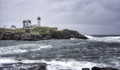
| 06/08/2017 09:38:43 PM | In order for the light to shine brightly, the darkness must also be present. ~ Frances Bacon by Ja-9Comment: Greetings from the Critique Club!
I find this to be an intriguing picture, albeit one seen many times before with the crashing surf/lighthouse/moody sky motif. I do love the way that the buildings look almost toylike on the shore. Use of ambient lighting is good, and I can almost see past the bleachiness on the wave crests ;-) Yet, I also find it bland - centered horizon, washy colours, that phone pole and wires in bg - just looks too snapshotty. FWIW I would try cropping out the last building on the left, I feel it helps to eliminate some problems in comp; a small hit of colour in the buildings to help them pop, and I think it would have done much better in voting.
Susan | | Photographer found comment helpful. |
| 06/08/2017 05:44:46 PM | | | Photographer found comment helpful. |
| 06/08/2017 05:44:04 PM | |
| 06/08/2017 05:43:21 PM | | | Photographer found comment helpful. |
|
Showing 381 - 390 of ~8163 |
Home -
Challenges -
Community -
League -
Photos -
Cameras -
Lenses -
Learn -
Help -
Terms of Use -
Privacy -
Top ^
DPChallenge, and website content and design, Copyright © 2001-2026 Challenging Technologies, LLC.
All digital photo copyrights belong to the photographers and may not be used without permission.
Current Server Time: 07/22/2026 03:47:33 AM EDT.
|