|
|
|
Showing 3271 - 3280 of ~8163 |
| Image |
Comment |
| 04/08/2010 09:10:04 AM | |  Photographer found comment helpful. Photographer found comment helpful. |
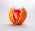
| 04/07/2010 10:33:27 PM | Deceptionby stanmooreComment: Greetings from the Critique Club!
Excellent idea and very good execution. Can't help but wonder if the birth of your child helped to inspire this shot (sorry, my dad was an OB/GYN when still in practice, so used to thinking along those lines :-)
Technically, wonder if you shot handheld, as the ISO seems quite high for a stationary studio shot. Looks quite soft from about the first third of the collective fruits to the back. Artistically, it's very textured and interesting, and for a shot cobbled together in roughly 10 minutes' time, very well done, and obviously the voters liked it.
Overall a very good job esp if you were operating on next to no sleep! Hope your wife and child are well.
Feel free to PM me with any questions,
Susan |
| 04/07/2010 10:20:00 PM | Training Courseby glad2badadComment: Greetings from the Critique Club!
I have to agree with the peanut gallery on this one. The foremost cone isn't the one holding the most interest, it's the ones farther back where the crash/fall occurred. Frankly I'd like to see a few of the bg cones knocked over too. The bike is down, so seems likely that there is a cone or two knocked down as well, no?
Otherwise, the composition is quite decent with both thirds and lines leading back to the downed bike. But the very shallow dof means you have excellent focus where nothing is happening, and oof where all the interesting stuff is taking place.
Hope this helps, feel free to PM me with any questions,
Susan | | Photographer found comment helpful. |
| 04/07/2010 10:00:34 PM | Sun Kissedby codfish709Comment: Greetings from the Critique Club!
An interesting take on the OrangeII challenge, and I am glad to see you did so well. Technically, in camera you did everything right - low ISO, fast shutter, shallow fstop for your subject matter. But I have to agree that the smudge/smoke? is distracting, as the rest of the bg is so clean. The border, in my opinion, is a little too much - for me anyway, too thick and too distracting. Not to mention that it cuts into that precious amount of space you have to play with.
Artistically, I like the tilt of the sun ornament and feel that it gives a sense of action and playfulness to the shot. The Orange is definitely there, you're on the right track. Just keep on shooting, think about thinning down the borders, and you will definitely improve.
Feel free to PM me with any questions,
Susan | | Photographer found comment helpful. |
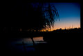
| 04/07/2010 09:51:18 PM | Sleepy riverby tinkie2010Comment: Greetings from the Critique Club!
Hello Tinkie, we meet again *insert evil snicker here* :-)
I like this photo a lot, but would classify it more as a Sunset shot than an OrangeII shot. There is quite a bit of black in the shot and the black border, in my opinion, just makes the image look much smaller than it is. Composition is Ok, and there seems to be a fair bit of light falloff on the upper right.
I can see why you shot at such high settings, but even so there is a bit of softness around the edges of the willow towards to the right. Better to shoot with a lower ISO and faster shutter speed...and yes a tripod would have helped too! And shooting at even a slightly lower POV would have given you a better use of thirds.
As always, take this critique for what it is worth and above all, keep shooting.
Feel free to PM me with any questions,
Susan | | Photographer found comment helpful. |
| 04/01/2010 11:03:22 AM | wingsby skewsmeComment: Lovely soft emotive shot! Great capture too! | | Photographer found comment helpful. |
| 03/23/2010 06:09:32 PM | Got Milk?by phooztComment: Greetings from the Critique Club!
First of all, glad that you took info from this site and put it to good use!
Compostionally the figurine is a teeny bit squeezed over to the right. The crop is quite tight. I'd have tried to position him about 1 inch to the left, just to give him the room. Lighting looks great, nice tones, no harsh shadows or hot spots, he is lit well enough. Not a bad job with what I am guessing was a kit lens, too.
At a guess you shot handheld; imagine what you could do with a tripod to hold the camera rock-still while you shoot at a much smaller aperture, for increased dof, and slower shutter speed.
Overall, a very quietly sweet picture, I enjoyed it when I saw it, and am glad to see you got a fave. Good work, keep it up!
Feel free to PM me with any questions,
Susan | | Photographer found comment helpful. |
| 03/23/2010 06:02:19 PM | Typeby dahvedComment: Greetings from the Critique Club!
Great textures, nice crisp lettering and not one but two sets of shadows on what looks like a stucco wall. Amazed you didn't get any obvious noise from shooting at such a high ISO, good work!
Compositionally very good, might have tried to completely knock out the last letter on the left, before the 'w' of water appears, that may have allowed you to squeeze in the 'r'. That may have also helped to define the 'e' a little more. (Suddenly I feel like I'm on Sesame Street :-) Otherwise, looks like you shot with the ambient light, and it did very well overall.
PP is fine, in that it's very minimal but the pic looks very good. Stick with it!
Feel free to PM me with any questions,
Susan | | Photographer found comment helpful. |
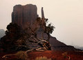
| 03/22/2010 06:47:45 PM | Forgotten World by JulietNNComment: Isn't that in New Mexico? Mitten Rock? Sure I've read about it in Tony Hillerman books. Anyway, great image, congrats on the red! :-) | | Photographer found comment helpful. |
| 03/22/2010 06:07:56 PM | | | Photographer found comment helpful. |
|
Showing 3271 - 3280 of ~8163 |
Home -
Challenges -
Community -
League -
Photos -
Cameras -
Lenses -
Learn -
Help -
Terms of Use -
Privacy -
Top ^
DPChallenge, and website content and design, Copyright © 2001-2026 Challenging Technologies, LLC.
All digital photo copyrights belong to the photographers and may not be used without permission.
Current Server Time: 06/17/2026 03:52:27 AM EDT.
|