Greetings from the Critique Club!
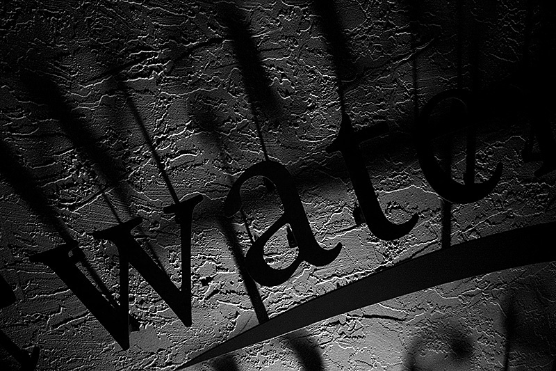
Great textures, nice crisp lettering and not one but two sets of shadows on what looks like a stucco wall. Amazed you didn't get any obvious noise from shooting at such a high ISO, good work!
Compositionally very good, might have tried to completely knock out the last letter on the left, before the 'w' of water appears, that may have allowed you to squeeze in the 'r'. That may have also helped to define the 'e' a little more. (Suddenly I feel like I'm on Sesame Street :-) Otherwise, looks like you shot with the ambient light, and it did very well overall.
PP is fine, in that it's very minimal but the pic looks very good. Stick with it!
Feel free to PM me with any questions,
Susan |






 Add photograph to your favorites
 Add photographer to your favorites

 Photographer found comment helpful.

