|
|
|
Showing 2221 - 2230 of ~8163 |
| Image |
Comment |
| 05/02/2012 02:38:50 PM | The Hero by gyabanComment: Wonderful work as always, Christophe! Not surprised that the hero's mount is a Maine Coon, we had one growing up and nothing bothered him. Now if only I can get my Birmans to look as heroic...;-) Huge congrats on the blue! |  Photographer found comment helpful. Photographer found comment helpful. |
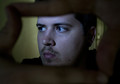
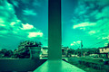
| 05/01/2012 04:43:55 PM | Self Framedby RowanNComment: Greetings from the Critique Club!
Not a bad shot and shows that you can hold still very well for 1/10...that's not easy to do. The oof fingers add a good frame, the light on you is a little hard but not enough to nitpick about. I would try to avoid centering yourself so much; possibly try this again but have your hands framing you at a greater distance from your face, as right now I get the impression that you're not too far from the lens. Try to put yourself at the right third but eyes as they are, dodged to the left. Should make for a stronger shot.
I see that you're new here and trust me, this site will teach you a lot - including how to grow a thick skin and put up with low scores til you hone your skills a bit more and produce stronger images. Which you will do, and I have seen good work in your portfolio, and I feel that you have the basic technicals of comp and lighting down. Now it's time to push the creativity.
Hope this critique has been useful, and feel free to PM me.
Susan | | Photographer found comment helpful. |
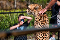
| 05/01/2012 04:35:27 PM | always in someones frameby disassociationComment: Greetings from the Critique Club!
Nice shot of a cheetah albeit one in captivity and with a chain leash...*sigh* but at least it leads a safer and more peaceful life in a zoo. This is a very well-seen moment with the other photog just as intent on getting his shot! :-) Good colours, pp not overdone.
A tighter crop would have helped with this image, imho. From the bottom point of the boy's elbow and squared of at the arm entering the frame from the top right. There would still have been some haze from the oof railing, but I would rather risk that than have the lower half of the bodies in view.
Hope this helps, keep on shooting and entering!
Feel free to PM me
Susan | | Photographer found comment helpful. |
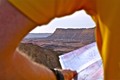
| 05/01/2012 11:37:08 AM | Lost in the desertby talzamComment: Greetings from the Critique Club!
Well, I can't fault you for not using an interesting POV, that's for sure! At first I had no idea what the frame was, had to see the map first then realize it's an armpit shot, with some cliffs emerging from the person's side :-) I might nitpick at the sleeve/arm being oof, as DPC likes their foregrounds tack, but it all comes down to what works for you.
Clearly you scored some points for that alone but it also cost you a bit in terms of overall score. But if it makes you happy, shoot what you like - works for me and more than a few others here.
Feel free to PM me
Susan | | Photographer found comment helpful. |
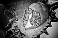
| 05/01/2012 11:32:49 AM | l'escargot d'argentby gclarkComment: Greetings from the Critique Club!
I like this shot, this is the kind of thing I've done in the past. The use of a backlit shell to frame the nicely lit and detailed ring works well, and the focus on the ring is tack. Nice wotrk, and the b/w seems to bring out the best in the shell and and ring.
To me the image looks a bit on the small side, never be afraid to make the most of the size limits here. The larger the better.
Feel free to PM me
Susan |
| 05/01/2012 11:27:25 AM | Two Sides of the equationby mlianoprComment: Greetings from the Critique Club!
Nice use of long exposure and an interesting use of colour, for sure. Compositionally it's only an OK shot, I've seen much better in your portfolio. The actual scene itself is a bit humdrum, perhaps that's why you chose to go with the underwater colour filter? This to me is a too common problem, relying on PS or similar programs to rescue a shot. Sorry, but when the pp overwhelms the actual image, your vote will as a general rule, suffer. Tactful use of pp can enhance a good image, but too much will ruin any shot, good or bad.
Feel free to PM me
Susan |
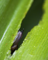
| 04/30/2012 12:41:52 PM | Creepby YomiComment: Greetings from the Critique Club!
Very good placing for an 'Ewww' subject (as opposed to an 'OOOOOHH' or 'Awwwww'). Love the eyestalk poking out like that, grossly cute and funny. Love the textures you caught esp on the skin. Compositionally very well done as the angled lines lead you straight to him/her/it. Well seen and just enough colour to make the image pop.
Glad you're back, please stay and enter some more!
Susan | | Photographer found comment helpful. |
| 04/30/2012 12:37:16 PM | | | Photographer found comment helpful. |
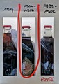
| 04/30/2012 12:34:56 PM | Nostalgic Coca Colaby marabu61Comment: Greetings from the Critique Club!
Hello Daniel, I'm Susan and I'll be your CC member today :-) I know how tough chefs have to be (I work in a fine-dining restaurant) so I know you can take criticism.
Interesting take on the challenge. I think you may have tried to do a little too much here; the plastic in or around the Coke bottles isn't really necessary. The Coke bottles are different shapes and each already has its own frame, so wondering why the red drawstring/handle draping down? It could be to draw attention to the middle bottle which looks to be the most interesting, as you can read the label and see the design. But as it stands, it's ambiguous and a little on the messy side.
It's not unlike plating a dish, you want just the right amount of side and veggies to enhance and complement the entree, not compete with it. Think of your subject as the entree, then your comp and lighting as the side and veg, and the background is your plate. And as with most creative endeavours, less is definitely more.
Here's a trick I recommend to help you see for yourself what works. Choose a challenge, then go through all the entries...but start at the very last page, and work your way up to the ribbon winners. As you do this you will notice the comp and lighting improving and getting tighter, and depending on the challenge, the level of editing getting more skillful.
Hope this critique has been of help, and do feel free to PM me with any questions or comments.
bye for now and welcome to the madhouse! :-)
Susan | | Photographer found comment helpful. |
| 04/30/2012 12:10:46 PM | Fishing by the beachby ajemieComment: Greetings from the Critique Club!
Very effective use of framing, silhouettes to offset silhouettes :-) The setting sun and reflection help to inject colour and interst to the shot, and the boy's silhouette is great. Looks like he just did a big cast and is waiting for the lure to sink a bit.
Compositionally not much to nitpick, though the unattended pole is too centred with the current crop. If you try cropping out the far left side so you get only the right edge of the trunk in the frame, you lose that extraneous bit of bg visible to its left, which doesn't need to be there.
Overall a good scenic shot, and you scored well overall, keep up the good work!
Feel free to PM me,
Susan | | Photographer found comment helpful. |
|
Showing 2221 - 2230 of ~8163 |
Home -
Challenges -
Community -
League -
Photos -
Cameras -
Lenses -
Learn -
Help -
Terms of Use -
Privacy -
Top ^
DPChallenge, and website content and design, Copyright © 2001-2026 Challenging Technologies, LLC.
All digital photo copyrights belong to the photographers and may not be used without permission.
Current Server Time: 05/23/2026 11:40:22 AM EDT.
|