|
|
|
Showing 1011 - 1019 of ~8163 |
| Image |
Comment |
| 01/05/2016 09:08:22 PM | |  Photographer found comment helpful. Photographer found comment helpful. |
| 01/05/2016 09:07:23 PM | | | Photographer found comment helpful. |
| 01/05/2016 09:06:40 PM | | | Photographer found comment helpful. |
| 01/05/2016 09:05:13 PM | | | Photographer found comment helpful. |
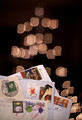
| 01/04/2016 06:56:21 PM | International Christmas Mailby primabarbaraComment: Greetings from the Critique Club!
Let me start off by saying that I like the bokeh filter, must try to make one :-) I like that they aren't jagged all around, the rounded parts give a Christmas-ornament feel to the shot. The focus on the one letter from Japan is very good as that face has so much character to it! Also like being able to see and read enough of the other stampmarks to give an idea as to where they came from and how the stamps define each country.
I think many read the composition as a little on the casual side, and the portrait orientation might have hurt your score a little. I gave a 6 during voting but it honestly didn't catch me enough to warrant voting higher. The blank space in the middle third of the pic disconnects the top part of the tree from the cards, and that may have been just enough to disengage voters. Show us a story!
Hope this helps
Susan | | Photographer found comment helpful. |
| 01/04/2016 06:45:11 PM | Mail deposited hereby clickodakComment: Greetings from the Critique Club!
Hah, I guess this was a work of Marcel :-) Nice true Canada Post red on the mailbox, the obligatory bilingual lettering, great focus, the settings are perfect for this capture...so what held it back?
I think that the lack of both size, space and human interaction of some sort are what stopped this image from doing better. Voters like to see a story and though you meant to show it as a letter starting its journey, the idea would have been better conveyed with a hand inserting the envelope into the mailbox. Look at the winning entry and I think all you see is a hand, but it's part of a person, and so we can all relate to going to the mailbox and reaching in to get whatever's there, be it a bill (ugh) or a Christmas card from a loved one.
Dare I say that this shot almost has a corporate feel to it, like CanPost paid you to take it; the very small size of it on the short side and lack of showing anything else going on around it. Is this inside a building or out on the street somewhere? We don't know, there isn't enough of the space around it to show us and give us some sense of place and story.
Hope this helps and keep up the good work,
Susan | | Photographer found comment helpful. |
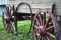
| 01/03/2016 08:09:23 PM | old worn wagonby jgirl57Comment: Greetings from the Critique Club!
Hi Julie! *waving* I agree, those wheels are off (or on, depending on your point of view) a real old wagon. The fact that they still have mostly intact wood rims (well at least the front one does) is astounding. The other two look like spares! :-)
I do wish that the foremost wheel, in the lower right, were entire. I know that the rim and the rearmost wheel are still technically wheels, but by now you know how persnickety voters are about things meeting the challenge descrip, and they want to see entire wheels dammit!
Otherwise the ambient lighting is OK, tipping a little towards being over-exposed; at least it doesn't look like you shot during high noon which could have caused some problems there with the paint and barnboard wagon sides. Comp is fine but for the cut-off wheel, which was already discussed.
You're doing fine, kiddo, keep up the good work and keep entering!
Susan | | Photographer found comment helpful. |
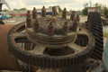
| 01/03/2016 08:00:48 PM | Shipyard wheelby morpurgoComment: Greetings from the Critique Club!
I really like the angle you shot this from, but the big problem is the background. Your subject is in browns and greys and faded blues, almost all neutral toned colours, and behind it the areas of red to the far left and far right immediately draw the eye away, as does the dark blue to an extent. This is one of those few cases where I would suggest a tighter crop (getting rid of as much of the bg clutter as you can) and converting the image to b/w, so the viewer focuses more on the form of the wheel which is what is important here. Playing around with angles by shooting from different areas around the wheel - higher up, lower down etc - would help too.
Hope this helps
Susan |
| 01/03/2016 07:52:04 PM | t i c k • t o c kby Ja-9Comment: Greetings from the Critique Club!
*muttering to self* aw damn another HM...Oops! Hi there Janine! ;-)
Very difficult to find flaws with an image like this. Lovely b/w rendering of the innards of an old pocketwatch, and it works beautifully. Great lighting, dead-simple comp and it all works beautifully. ISO seems a little high, but you did use a pretty small aperture and for a stationary macro, an exposure that's not excessively long or short.
Otherwise can't find any nits to pick here! Which is a good thing :-)
Belated congrats on the HM and keep up the good work
Susan | | Photographer found comment helpful. |
|
Showing 1011 - 1019 of ~8163 |
Home -
Challenges -
Community -
League -
Photos -
Cameras -
Lenses -
Learn -
Help -
Terms of Use -
Privacy -
Top ^
DPChallenge, and website content and design, Copyright © 2001-2026 Challenging Technologies, LLC.
All digital photo copyrights belong to the photographers and may not be used without permission.
Current Server Time: 07/25/2026 12:21:49 PM EDT.
|