|
|
|
Showing 2071 - 2080 of ~3441 |
| Image |
Comment |
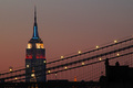
| 06/06/2006 02:07:35 PM | Shades of the Empire Stateby Nikolai1024Comment: ::: Greetings from Critique Club :::
Hi, as requested, here is an indepth critique of your submission.
First Impression - the most important one:
Very nice shot. I particularly like the colors of the sky and the leading lines of the bridge. This is a postcard shot for sure.
Composition:
Works well with the position of the building and the leading lines of the bridge.
Subject:
Composition has done everything for you to highlight the subject.
Technical (Color, focus, and light):
Color looks good, I really like it.
Focus is sharp, but you may have over-sharpened it just a bit in post-process.
Light looks good, but the sky is just a bit noisy. If you had selectively blurred that noise, I think voters would have raved over this image.
To grow its vote?:
That noise issue in the sky for one would have helped. Other than that, I really can't think how you could have improved this photo much.
Summary:
Great work here. Keep it up :-)
Hope to see more from you soon,
Leroy |
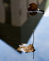
| 06/06/2006 01:33:43 PM | Subtle Architectureby vjozComment: ::: Greetings from Critique Club :::
Hi, as requested, here is an indepth critique of your submission.
First Impression - the most important one:
Interesting shot, but comes off a bit too abstract for an architecture shot.
Composition:
I like the composition. It's unique and strong.
Subject:
OK, here's where I get a bit confused. The subject here is the leaf, which stands out strong against the background. However, you are entering into a challenge on architecture. Hence, I believe a deeper DoF is needed to have the building a bit more in focus. The funny thing about reflections is that you must add more DoF to have them in focus (the distance from reflector to what is being reflected is important in your DoF choice).
Technical (Color, focus, and light):
I think all technicals are good, other than the DoF issue I just talked about.
To grow its vote?:
I think if we could emphasize the building more with a deeper DoF the score would have been a LOT higher. I had to look for quite a bit to see the building. Voters don't generally give you that luxury.
Summary:
It was a creative take on the challenge and I hate to see it got bashed in voting.
Hope to see more from you soon,
Leroy |  Photographer found comment helpful. Photographer found comment helpful. |
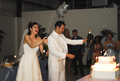
| 06/06/2006 01:26:10 PM | Party Timeby Travis99Comment: ::: Greetings from Critique Club :::
Hi, as requested, here is an indepth critique of your submission.
First Impression - the most important one:
Very nice wedding candid. I'm particularly amazed with the lack of harsh shadows that come from flash photography in low-light.
Composition:
Good for a candid shot. It does take on some of the look of a snapshot, but a well done one.
Subject:
Subjects are clear and stand out really well from the background.
Technical (Color, focus, and light):
Focus is good. Colour is a bit on the warm side, but not too terribly distracting.
You did well with the flash lighting in this low light situation.
To grow its vote?:
It's a great wedding photo, but just does haven't that special oomph that DPC voters want. Maybe some over-the-top editing for more drama and a different crop for a stronger composition.
Summary:
I like this photo. It show competence on the part of the photographer in low light situations.
Hope to see more from you soon,
Leroy |
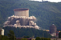
| 06/06/2006 04:07:11 AM | Nuclear Power...by sceliaComment: ::: Greetings from Critique Club :::
Hi, as requested, here is an indepth critique of your submission.
First Impression - the most important one:
What a lucky capture to have had for this challenge :-) Definitely not a typical shot here.
Composition:
Composition is ok. I think it works well for this image.
Subject:
The subject stands out well from the wooded background.
Technical (Color, focus, and light):
Focus seems ok. Light is pretty good, but the blue tint to the shadows in the trees is a bit distracting. I'm thinking this was probably a Haze issue with UV light. I think you could have taken care of that with slective color in photoshop.
To grow its vote?:
The color issue probably could have grown its vote a little, More agressive editing could have made this shot more dramatic.
Summary:
I really think this shot is cool. And am glad to see that it scored reasonably well in this challenge. NICE CAPTURE!
Hope to see more from you soon,
Leroy |
| 06/05/2006 12:20:38 AM | | | Photographer found comment helpful. |
| 06/04/2006 01:20:00 PM | | | Photographer found comment helpful. |
| 06/03/2006 10:05:40 PM | | | Photographer found comment helpful. |
| 06/03/2006 11:57:49 AM | | | Photographer found comment helpful. |
| 06/03/2006 11:55:09 AM | | | Photographer found comment helpful. |
| 06/02/2006 06:36:16 PM | | | Photographer found comment helpful. |
|
Showing 2071 - 2080 of ~3441 |
Home -
Challenges -
Community -
League -
Photos -
Cameras -
Lenses -
Learn -
Help -
Terms of Use -
Privacy -
Top ^
DPChallenge, and website content and design, Copyright © 2001-2026 Challenging Technologies, LLC.
All digital photo copyrights belong to the photographers and may not be used without permission.
Current Server Time: 06/21/2026 11:56:49 AM EDT.
|