|
|
|
Showing 2011 - 2020 of ~3441 |
| Image |
Comment |
| 06/10/2006 03:12:57 PM | a breath of fresh air.by andrewreinerComment: Cute. I have issues with the seams in the paper. I've found that for shots like these the glossy side of a white sheet of poster paper works great. Just thought I'd let ya in on that tip. Cheap, yet effective :-) |  Photographer found comment helpful. Photographer found comment helpful. |
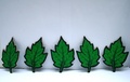
| 06/10/2006 01:14:09 AM | All We Need Is Loveby david1707Comment: ::: Greetings from Critique Club :::
Hi, as requested, here is an indepth critique of your submission.
First Impression - the most important one:
HAHA, yeah that's a LOT of LOVE LOL. Firat thing that I notice in this picture is issues with trying to blur the background in Photoshop. It just didn't work for you, it just didn't come off as natural and shows haloing around the edges.
Composition:
Not extremely powerful. For one the middle fingers flyin' in the air are a bit too close to the top of the photo and get lost up there. Move them down to about the top thirds line and it'd work well.
Subject:
The subject, which I think is more the fingers flyin' gets lost at it's current position.
Technical (Color, focus, and light):
Color and lighting are good, but focus is a bit soft. As a rule, always apply a bit of USM after resize for a sharp shot.
To grow its vote?:
When you do edits like this, make sure they are complete before entering. If it looks unnatural or unfinished, voters are going to slam you.
Summary:
Even though it has flaws I really think it's funny as hell, especially with that title :-)
Hope to see more from you soon,
Leroy |
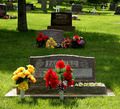
| 06/10/2006 01:06:20 AM | "You're the one I love, I think about you all the time"by angela_packardComment: ::: Greetings from Critique Club :::
Hi, as requested, here is an indepth critique of your submission.
First Impression - the most important one:
Hey look, I finally get to critique one for my pal :-) My first impression was that it is very touching and nicely colored and composed.
Composition:
I like the square crop. If I were to change it any, I'd move the grave down to almost touching the bottom of the photo.
Subject:
I think it stands out well from the background. Maybe a little less deep DoF would have helped some but not too much, I think a lot of bokah in the background would have been really distracting.
Technical (Color, focus, and light):
All good. I don't think I'd change anything technically on this photo.
To grow its vote?:
Voters suck, we know that ;-) It's a good shot and IMO a bit under-rated. It has emotion and thought in it.
Summary:
I like it. Ofcourse you knew that. But, keep up the good work.
Hope to see more from you soon,
Leroy | | Photographer found comment helpful. |
| 06/10/2006 12:39:28 AM | | | Photographer found comment helpful. |
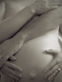
| 06/10/2006 12:35:43 AM | Unfetteredby WickedBComment: ::: Greetings from Critique Club :::
Hi, as requested, here is an indepth critique of your submission.
First Impression - the most important one:
Nice shot, nicely lit and attractive subject. Congrats on your personal best score.
Composition:
The composition is pretty good, but the lighting hurts the overall comp some. I believe a tighter (perhaps square) crop to exclued the lower body would have produced a more appealing image. Not that this one is bad by any means.
Subject:
Nothing to distract me from the subject. That's always a plus :-)
Technical (Color, focus, and light):
Color: I'm thinking I would desaturate the photo just a bit as it's looking just a bit too red to me.
Focus: looks good and sufficient DoF to keep the entire subject in focus.
Light: I like the overall lighting. Very nice. I'm not liking the lighting fall off on the legs. I think I would have cropped the image just above the pubic mound to deal with this issue.
To grow its vote?:
The few issues I called out would have grown the vote quite a bit. Technically, it's a great photo and I kinda think it's a bit under-rated. But, them's the breaks.
Summary:
Really nice work. Keep it up.
Hope to see more from you soon,
Leroy | | Photographer found comment helpful. |
| 06/10/2006 12:23:03 AM | Ain't she sweet (sugar)by Dan_CottleComment: ::: Greetings from Critique Club :::
Hi, as requested, here is an indepth critique of your submission.
First Impression - the most important one:
RAWKS! ROCKS! Great shot and congrats on the top 20!
Composition:
Wonderful. Great use of negative space. This compostion just works.
Subject:
Nothing distracts me from the subject of this shot, always a good thing.
Technical (Color, focus, and light):
Pretty much technical perfection. Nothing I can tell you to improve this shot.
To grow its vote?:
It might have done better in the Single Light Source challenge, who knows? But, I really can't tell you of anything you could have done to get more votes on this shot.
Summary:
I can't tell you how good I think this photo is. It's just awesome! Good job and again congrats on the top 20 and your new personal best score!
Hope to see more from you soon,
Leroy
Edit too add: Adding photo to my favorites. Message edited by author 2006-06-10 00:27:50. |
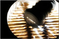
| 06/10/2006 12:04:19 AM | emmm.....YUMMY~by eggfoxComment: ::: Greetings from Critique Club :::
Hi, as requested, here is an indepth critique of your submission.
First Impression - the most important one:
I generally like zoom blur, but it isn't working for me here.
Composition:
Not the strongest. I think the lenscap being dead center of the photo really hurts the comp a lot.
Subject:
It ends up pretty much being the lenscap, when I thik you wanted the lens itself to be the subject.
Technical (Color, focus, and light):
Color is fine.
Focus is a tad soft, which happens in these types of shots.
Light: It's a bit harsh and blowing highlights everywhere. It's a nice artistic effect, but doesn't work here.
To grow its vote?:
Well, other than the issues above, camera related photos just don't score well at DPC.
Hope to see more from you soon,
Leroy | | Photographer found comment helpful. |
| 06/09/2006 11:54:46 PM | Tolharubang (Model)by John_LeeComment: ::: Greetings from Critique Club :::
Hi, as requested, here is an indepth critique of your submission.
First Impression - the most important one:
I read your comments and before I would have sworn this was a huge statue in a cavern with some sort of natural light.
Composition:
I'm going to have to agree with Shutterpug, I want to see more of it and I think portrait orientation would have been a better choice.
Subject:
Nothing distracting me from the subject. That's always good :-)
Technical (Color, focus, and light):
I'm gonna go ahead and say the technicals are all good. I perhaps would go with just a bit deeper DoF, but otherwise nice.
To grow its vote?:
To be honest, this looks very much like natural light in a challenge that called for "artificial" light. I think that may have worked against you. But it was good work on your part.
Summary:
I love it. I need to get one of those. It's cool.
Hope to see more from you soon,
Leroy |
| 06/09/2006 11:46:53 PM | | | Photographer found comment helpful. |
| 06/09/2006 11:38:41 PM | Lucy in the Sky...by ApeeComment: ::: Greetings from Critique Club :::
Hi, as requested, here is an indepth critique of your submission.
First Impression - the most important one:
Nice!
Composition:
Love the composition. I really does a LOT to make this photo, especially with the clouds floating overhead.
Subject:
She's right there, nothing to distract from her.
Technical (Color, focus, and light):
Color is good, so is focus.
Light:The glare on the cheek and nose, I think I would have tried to clone out, just a bit distracting.
Other: I also would have done a bit of desat on the teeth to get rid of a bit of yellowing.
To grow its vote?:
Kill the other entrants :-) Actually, it was just a tough challenge and pretty girls alone just don't go far with voters.
Summary:
I really like this photo. I'm sure she does too.
Hope to see more from you soon,
Leroy | | Photographer found comment helpful. |
|
Showing 2011 - 2020 of ~3441 |
Home -
Challenges -
Community -
League -
Photos -
Cameras -
Lenses -
Learn -
Help -
Terms of Use -
Privacy -
Top ^
DPChallenge, and website content and design, Copyright © 2001-2026 Challenging Technologies, LLC.
All digital photo copyrights belong to the photographers and may not be used without permission.
Current Server Time: 06/21/2026 10:46:25 PM EDT.
|