Image |
Comment |
| 05/08/2003 10:23:33 AM |
Floatsby KathycComment: Your image creates a feeling of coolness which is appealing. I particularly like the way you have cropped this, well done. (I didn't know you could get glass floats!) |
| 05/08/2003 10:20:47 AM |
Uh Oh!!by BigSmilesComment: Nice capture, I like the pyschedelic feel to your image. The colors you've chosen work well together, well done. |
Photographer found comment helpful. |
| 05/08/2003 10:12:54 AM |
ice cube in my glass...by sotsotComment: Amazing textures you've created and wonderful blue tones. Maybe I would have done something to the crop to get rid of those white blown out spots in the lower corners. But I like it! |
Photographer found comment helpful. |
| 05/08/2003 10:10:39 AM |
|
Photographer found comment helpful. |
| 05/08/2003 10:10:00 AM |
Turtle In A Glassby AlexanderComment: This is original and humorous and well taken. My only gripe are the fingerprints visible on the glass. |
Photographer found comment helpful. |
| 05/08/2003 10:08:44 AM |
|
Photographer found comment helpful. |
| 05/08/2003 10:03:31 AM |
The Boldt Familyby autoolComment: Critique Club:
Hi Richard. I must confess when I voted on your pic in the challenge I didn't catch the story line until much later when I re-adjusted and I pushed up my original vote.
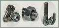
I think you have created a very humorous image which in my opinion was scored and placed much lower than it really deserved. Okay it isn't really a "wow" photo, but it is a photo with a lot of charachter and tells a continuing story, something which only a handful of photos in the challenge were able to do.
Technically, the layout and composition is good. The border is fitting to the image and the color scheme is also bang on. The lighting is excellent and I detect no dark areas and also now blown out spots. Setting up lighting for shiny objects is very difficult and you have mastered that here.
As was already commented below a couple of times, it is a pity that some of the bolt's heads are not fully visible in the third image. Perhaps if you had enlargened all the ovals a little more and increased the size of the overall image you would have gotten around that.
Also a tad more unsharp mask may have been necessary in my opinion to give the nuts and bolts a crispier appearance. They appear a little on the soft side.
Other than that this is a top multi-composition which, as I already mentioned, was extremely underrated.
Gary |
Photographer found comment helpful. |
| 05/08/2003 09:31:17 AM |
Join us for Supperby CreativeFlyPhotoComment: Is that the moon up there in the sky? You chose the right shutter speed for this image, those lights are bright but not blown out at all, good. I would have tried a few different variations on text style though, the one you chose looks a little bland. |
Photographer found comment helpful. |
| 05/08/2003 09:28:44 AM |
Mobil Pegasusby cmrk74Comment: That is an original perspective! Good idea, especially with the sun shining on the right building and only shadows on the left one. The border is interesting although it isn't enhancing this image much. |
Photographer found comment helpful. |
| 05/08/2003 09:26:06 AM |
For Mother's Dayby myqylComment: Typical postcard shot for sure. Somehow however the colors aren't coming through as well as they should. You could have remedied this by adjusting the levels or saturation in a editing program. Good luck. |
Photographer found comment helpful. |
Home -
Challenges -
Community -
League -
Photos -
Cameras -
Lenses -
Learn -
Help -
Terms of Use -
Privacy -
Top ^
DPChallenge, and website content and design, Copyright © 2001-2025 Challenging Technologies, LLC.
All digital photo copyrights belong to the photographers and may not be used without permission.
Current Server Time: 09/13/2025 08:10:30 PM EDT.