| Image |
Comment |
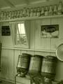
| 08/26/2003 06:30:31 AM |
Milkin' Barnby muckpondComment: This is one of my three top favourites for this challenge. It immediately gives me the feeling I am back in the past in this actual room, wonderful! |
 Photographer found comment helpful. Photographer found comment helpful. |
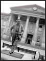
| 08/26/2003 06:16:19 AM |
Lord Wilson of Rievaulxby BobsterLobsterComment: That guy looks like he's in a hurry :-) I like how you put the tilt into the image, it does a lot for it. Good lighting (although it was taken at midday :-) and the idea to convert to grayscale was the best choice in my opinion. |
| Photographer found comment helpful. |
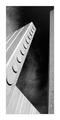
| 08/26/2003 06:01:36 AM |
November 22, 1963by crabappl3Comment: I don't know how you got that effect with one pillar tilting inwards and the one on the right being straight but it works! And how! The texture of the clouds in the background gives this that extra boost. The framing is spot on n'all. If this doesn't ribbon I'm selling my camera and taking up chess :-) |
| Photographer found comment helpful. |
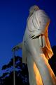
| 08/26/2003 05:58:28 AM |
Sam Houstonby jab119Comment: This is an amazing photo, the contrast between the blue sky, black tree silohuettes, statue color and yellow light is an optimal mix. Just fantastic! This is one of my top picks for a ribbon. |
| Photographer found comment helpful. |
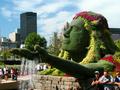
| 08/26/2003 05:01:31 AM |
Mosaicultureby nathaliedooComment: This is a nice statue, is that grass all around it? The rest of the photo seems a little too busy with all the buildings and tourists everywhere. I guess you couldn't have told everyone to go away, but maybe a different shooting angle could have made a difference. Perhaps going in lower and shooting upwards to get more sky into the shot and less people could have been a good idea. |
| Photographer found comment helpful. |
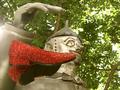
| 08/26/2003 04:46:12 AM |
Tin-Manby justineComment: Wizard of Oz right? The main focus is on the head and the shoes and hand are not fully in focus. Also the shoes seem to be a little distracting in the postion you have them. A slightly different shooting angle and different f/stop would have improved this somewhat. |
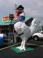
| 08/26/2003 04:43:15 AM |
Site of the First Chicken Sandwichby rooComment: Funny statue :-) The background is a little too busy though. Maybe you should have tried to shoot this from a different angle. A good idea might have been to get down a little and shoot upwards so that you get more sky in the background and less building and power lines. |
| 08/26/2003 04:41:24 AM |
monument to freedom by magnetic9999Comment: That's a beautiful monument which you've portrayed excellently. I guess this is the late evening sunlight you've captured there? Your monument is bathed in such a soft soothing light, it gives off a serene feeling, especially with the added bonus of no people being in the image. The decision to leave the trees in the pic only does this justice. This is good work! |
| Photographer found comment helpful. |
| 08/26/2003 04:37:40 AM |
|
| Photographer found comment helpful. |
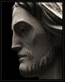
| 08/26/2003 04:26:51 AM |
How Great Thou Artby jmsetzlerComment: I particularly like the play of light and shadow in this photo. It's one of those images where you can't decide if it is too dark or not, so I guess if I have to ask myself that, then it must be spot on. The contrasting is pleasing to my eyes, especially the darker shadows in the chiselled out areas compared to the lighter flatter areas. The pure black background brings our the contours of the face more prominently. This is very good work. |
Home -
Challenges -
Community -
League -
Photos -
Cameras -
Lenses -
Learn -
Help -
Terms of Use -
Privacy -
Top ^
DPChallenge, and website content and design, Copyright © 2001-2025 Challenging Technologies, LLC.
All digital photo copyrights belong to the photographers and may not be used without permission.
Current Server Time: 11/22/2025 01:51:38 AM EST.