| Image |
Comment |
| 11/11/2003 12:32:58 PM |
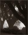
Bowby sherComment: A very appropriate title, and I like your idea of differring contrasts here. There seem to be three phases. The tree at the front is in high contrast, the trees behind less and the cemetary out the back even less, as if it is in the fog (which I guess it is). |
 Photographer found comment helpful. Photographer found comment helpful. |
| 11/11/2003 06:53:20 AM |
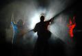
Sacred Worshipby jmark53Comment: The smoke in the light effect is fantastic. The people with their arms up in the air is a good capture, the red light from the right and the bluish light from the left increase the impact a lot. The crop is a little uncentered, I would have given a little more space to the girl on the right, or less to the girl on the left. (9)
Looking at this again I only just realised the guy is holding a guitar. |
| Photographer found comment helpful. |
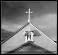
| 11/11/2003 06:49:20 AM |
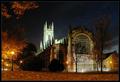
St. Peter's at Dusk by mbardeenComment: The contrasts of the dark blue sky and the orange toned leaves and light are a perfect mix as a surrounding for your church. It gives your image a lot of life and charachter. Had you only had the church alone the effect wouldn't have been as good as it is here. Top marks for this one (10) |
| Photographer found comment helpful. |
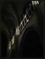
| 11/11/2003 04:58:46 AM |
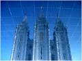
Reflections on Eternityby dsidwellComment: Cool effect! I always like seeing originality in photos and people trying out new ideas. The effect is very good here, the criss cross lines look like a kind of grid being beamed outwards by the church in the background. The blue works well and brings an element of coolness into the image. A slight tilt to the left might have squared it up a little, I get the feeling it is leaning to the right, but then again it might be because I had too much wine last night and can't look at things on a normal level this morning :-) You've flipped this image, haven't you! |
| Photographer found comment helpful. |
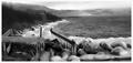
| 11/11/2003 04:34:06 AM |
Positive Space by jjbeguinComment: Good play of shadow and light, especially the way the sunlight is highlighting a parallel line toward the top of the photo there. The perspective is also very appropriate. |
| Photographer found comment helpful. |
| 11/11/2003 04:31:20 AM |
San Filipe de Neriby Firstrich1Comment: Interesting concept, the perspective you have chosen is also good. Did you climb up a tree or something to get the top of the roof at the same height and level? I find the composition is leaning a little to the right however. If you put a ruler at the bottom of the photo following the horizintal line you'll see what I mean. It is quite minimal actually, but the eyes pick it up quickly. |
| Photographer found comment helpful. |
| 11/11/2003 03:25:05 AM |
Asian graceby AnastasiaComment: Originally posted by vballer3:
thats NASTY!!!!!!!!!!!!!!!!!!!!!!!!!!!!!!!!!!!!!!!!!!!!!!!!!!!!!!!!!!!!!!!!!!!!!!!!! |
Now how did she know this is your pic :-) Or did she really mean "nasty". Or Nasti?
Anyway Nasti, this was waaay underrated. The quality is excellent, almost shadowless only a slight shadow to be seen around her shoes. Perfect lighting! 12 ones and 12 twos and 19 threes is so insulting. I can imagine some people didn't think it met the challenge in some way, but to score such a quality photo so low is beyond me. |
| Photographer found comment helpful. |
| 11/11/2003 03:17:26 AM |
|
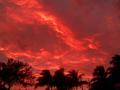
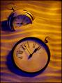
| 11/10/2003 09:18:47 AM |
Endless Timeby JeileenComment: The trees swaying in the wind give me the impression of stormy weather. Along with those angry looking clouds makes for a great photo. Congrats on your top scoring photo so far. |
| Photographer found comment helpful. |
| 11/10/2003 07:47:55 AM |
|
| Photographer found comment helpful. |
Home -
Challenges -
Community -
League -
Photos -
Cameras -
Lenses -
Learn -
Help -
Terms of Use -
Privacy -
Top ^
DPChallenge, and website content and design, Copyright © 2001-2026 Challenging Technologies, LLC.
All digital photo copyrights belong to the photographers and may not be used without permission.
Current Server Time: 01/13/2026 06:55:58 AM EST.