| Image |
Comment |
| 11/19/2003 03:52:58 AM |
|
 Photographer found comment helpful. Photographer found comment helpful. |
| 11/19/2003 03:49:54 AM |
|
| Photographer found comment helpful. |
| 11/19/2003 03:20:28 AM |
|
| Photographer found comment helpful. |
| 11/19/2003 03:18:39 AM |
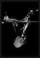
''Ice Fall'' by Shannon O'Cork by kiwinessComment: Wow wow wow! Thanks for all your comments and votes. I'll never get tired of the feeling I get when I wake up in the morning and find I got a ribbon waiting for me. Yassir, I LIKE it :-)
Natator, I am away from home at a seminar at the moment but once I am back I'll put up a link to the original. |
| 11/14/2003 09:48:24 AM |
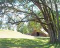
Home Sweet Homeby christyrackComment: I am trying to determine here what your main subject is. The main focal point are the trees at the front and the grass in the foreground. Your title is Home Sweet Home, and seeing the building is a barn and not a house I am guessing you are refering to Home Sweet Home being the country life you live in. I would have gone down lower and maybe stood a little to the left to get more of the barn into your image. The tree branch hanging down is blocking out the top part of the barn, I want to see more of the barn. The grass in the sunlight and the roof of the barn is overexposed, maybe by metering off a brighter area or taking your exposure one stop down this might have been avoided. |
| 11/14/2003 09:39:03 AM |
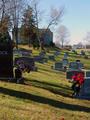
sacred groundby wkmenComment: Here I would have taken a different shooting position. I would have gone more to the right and shot more to the left, in this way the houses in the background on the right wouldn't have been included in the frame and also the grave stone you cut in half on the left would have been included. I would have rather seen one of the two front grave stones in the foreground in full, instead of two halves as you have here. |
| Photographer found comment helpful. |
| 11/14/2003 09:35:05 AM |
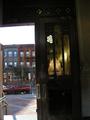
Mix of Church and Stateby rooComment: To be honest with you, this photo just doesn't jump out and grab my interest. The inclusion of the reflection in the door is an added touch and a good idea. However the car and post ouside are distracting my attention from the door. There is also a kind of halo around the closed door giving me the impression that there is a ghost standing in front of it. I would personally have gone for a different composition, including the whole door frame and maybe waiting till that car had gone. Also a shooting position more to the right to keep that pole out of the image, and last of all I wouldn't have included the wall on the left in your photo. |
| 11/14/2003 09:21:18 AM |
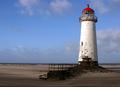
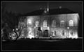
House of the Althingby sjonniComment: Personally I would have taken some steps backwards (unless there was a lake or something in the way that is) so that the whole building, inclusive flag pole was completely in the shot. The white line running through your photo at the bottom gives me the impression of car lights during a longer shutter speed. I know that isn't what it is, my guess is that it is a fence or something. At first glance however that is what I thought it was. |
| Photographer found comment helpful. |
| 11/14/2003 09:13:01 AM |
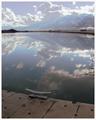
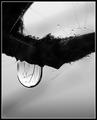
Sacred Water In God´s Natureby MonaComment: A technically well composed photo. The large water drop being the main focal point is complemented by the smaller water beads creating a very balanced harmony. |
| Photographer found comment helpful. |
| 11/14/2003 09:08:56 AM |
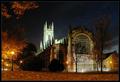
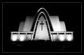
Touched by an Angelby arnitComment: Good lighting. Everything that needs to be seen is visible without any disturbing elements peeking through. The steps in front of the church are only slightly visible but in my opinion only adds to the quality. |
| Photographer found comment helpful. |
Home -
Challenges -
Community -
League -
Photos -
Cameras -
Lenses -
Learn -
Help -
Terms of Use -
Privacy -
Top ^
DPChallenge, and website content and design, Copyright © 2001-2026 Challenging Technologies, LLC.
All digital photo copyrights belong to the photographers and may not be used without permission.
Current Server Time: 01/13/2026 06:56:07 AM EST.