| Image |
Comment |
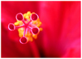
| 05/31/2006 02:03:57 AM |
Fuzzy Fiveby sammigurlComment: i gave this an 8 during voting. i cant imgine why it scored lower except for the people who hate flowers. i recently tried to photograph the same exact type of flower in my backyard and my results werent near as stunning as yours. dont beat yourself up about it. its fantastic. the focus, and DOF and everything are perfect to me. |
 Photographer found comment helpful. Photographer found comment helpful. |
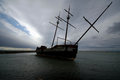
| 05/30/2006 07:55:57 PM |
Ghost Shipby KronusComment: this is really cool. i LOVE the composition how you kept all of the front mast/stick thingy(lol, yeah im stupid) but it extends to the corner. uses very seldom used space up there very well. and it looks like its going to fall over! so friggen cool. well done! |
| Photographer found comment helpful. |
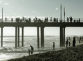
| 05/30/2006 07:31:05 PM |
people-at-pier.jpgby briantammyComment: The left hand side seems a touch too bright, and theres noise on the bridge. over all its a bit dull color wise. but the composition and "subject" is great. I think added contrast and neat image would make this have a wonderful dreamy quality. |
| Photographer found comment helpful. |
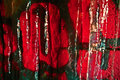
| 05/30/2006 07:28:34 PM |
dpcby KronusComment: I like the melted/wet paint feel of this but if those letters are supposed to spell dpc then I'd like to see more of the "d". I do think the right hand side of the c being different makes this better than if the whole thing were glossy. that would make it slightly boring. this gives it dimension. |
| Photographer found comment helpful. |
| 05/30/2006 07:21:32 PM |
Fogby justin_hewlettComment: I know your looking for a crituque but dude this is AMAZING! the border helps it look like an inspirational poster. im going to the north georgia mountains next week and im definately inspired to go now. this is wonderful. all i can come up with to possibly change(and its a stretch to say this) is maybe bump the contrast on the sky just slightly. I dont think i wold if i were you but i cant think of anything else that maybe be wrong with this. |
| Photographer found comment helpful. |
| 05/30/2006 06:56:24 PM |
Timberland: Go Anywhereby cools98Comment: this one looked so impressive to me as a thumbnail i was hoping for a little bit more when i opened it. it would be really nice if all of one thing was focused. like the whole shoe. or all the water, preferably both but i know how hard that really is to accomplish. i like your idea, the crop is close that from a personal stand point it makes me nervous for your cameras safety. lol ;) i hope you didnt get it wet! liek the composition too. nice idea |
| Photographer found comment helpful. |
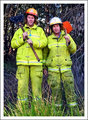
| 05/30/2006 06:44:35 PM |
Mark & Steve, Our Firemen Hero'sby sherpetComment: this is really nice. all id suggest is cloning out the dark spot in the upper left hand corner since cropping it out would make that side way too tight. also maybe burning the bright spot on the tree between them. and possiblydarkening the jacket of the man on the left. it seems a tad too bright. but just the tiniest bit, almsot an unnotticable amount. lovely photo. Luckiy you, such handsome models :) |
| Photographer found comment helpful. |
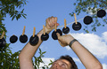
| 05/30/2006 06:36:56 PM |
Line dry onlyby srdanzComment: I gave this an 8. In comparison to what I usually get for scores to me this one scored pretty well but im sure you hoped for more. technically everything seems great. the clouds are beautiful, and the focus is great. especially on your arm. the only thing i dont like is that your head is cut off. but even if it were just your arms that would have been odd. i think it would have been much better without a person in it at all. hope that helps. :) |
| Photographer found comment helpful. |
| 05/30/2006 12:27:01 PM |
Reaching Outby ChikaZAWaComment: now that the challenge is over i'd be really interested in seeing what you would do with this in advanced editing. if the windows were a little darker/more reflective and the cross and black line across the roof were slightly darker i think it would look really cool. but thats just my opinion. i went for an angled shot for this challenge too. i like that perspective for this shot. may have helped to crop it a bit off center. but as it is its fantastic. especially for a first entry. im excited to see whats yet to come from you. and if your going to be at the Atlanta GTG this weekend, see you there! |
| Photographer found comment helpful. |
| 05/30/2006 12:07:28 PM |
Kite into the Sunby tonyvComment: i think the top half is absolutely perfect. i'd love to see a lot more contrast on the bottom and perhaps a soft glow/highlight around the man as he seems to blend in alot and I feel he should be more of a focal point, although contrast may be enough to fix that anyway. i think the angle is great, adds a lot of life to a shot that would be pretty boring if it had been shot straight on. nice work! |
| Photographer found comment helpful. |
Home -
Challenges -
Community -
League -
Photos -
Cameras -
Lenses -
Learn -
Help -
Terms of Use -
Privacy -
Top ^
DPChallenge, and website content and design, Copyright © 2001-2026 Challenging Technologies, LLC.
All digital photo copyrights belong to the photographers and may not be used without permission.
Current Server Time: 04/28/2026 05:01:08 AM EDT.