| Image |
Comment |
| 09/30/2009 10:57:48 AM |
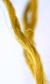
literally twistedby alinaComment: *not voting as I'm in this challenge-just commenting since I've seen requests for comments in the challenge thread*
I like this subject. I think it would be awesome used as faux branches to make up a pasta tree. The DOF is just a bit too shallow for me and I feel as if the closer bunch is in my way as the farther one appears almost to be a dancer stretched tall with arms over it's head, and I'd love to see more of it but that other ones in the way. just feels out of place.
HTH |
| 09/30/2009 10:55:15 AM |
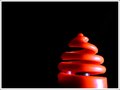
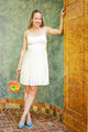
Spring Topby yjoshiComment: *not voting as I'm in this challenge-just commenting since I've seen requests for comments in the challenge thread*
Very interesting object. I like the placement of it in your frame but what is hurting it is the fact that it's plastic. Not really your fault or even something you can easily change but plastic just makes things look cheap and can tend to take away from the artsy feel and immiediately scream snapshot. I feel this would look lightyears better if it were metal even if everything else were to stay the same, shape, placement, bg, border. All of it. Just my opinon though. |
 Photographer found comment helpful. Photographer found comment helpful. |
| 09/30/2009 10:52:04 AM |
Do Not Litterby HeiSchComment: *not voting as I'm in this challenge-just commenting since I've seen requests for comments in the challenge thread*
I'm really intrigued by nearly everything being white. It's so odd to see that it makes you really study. I think that cold be helping AND hurting you. Makes me want to click on the thumbnail but studying it after that makes me take notice of the imperfections. It's an odd sort of double edged sword. I would prefer if there weren't the harsh shadows and there is some dirt/maybe sensor dust all over the image. which is just soooo hard to avoid with all this white in basic editing. I hope you are doing fairly well though. I do enojoy this image overall. |
| Photographer found comment helpful. |
| 09/30/2009 10:48:07 AM |
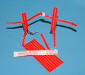
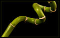
Twisted Sisters by JoaniePComment: *not voting as I'm in this challenge-just commenting since I've seen requests for comments in the challenge thread*
too cute of an idea. Love the creativity here. I also kinda dig how you've added the warning, gives this some extra life. What I would suggest to do differently is to concider complimentary colors when shooting. so maybe a green bg to go with the red, and to avoid harsh shadows put a light facing the bg but behind the subject. That can also had a very nice gradient as well. if not complimentary colors a plain black or white bg would always be a classic way to go as well. the blue just doesn't work here. just my opinion. and a slightly lower POV would probably help a lot too. I think shooting them more straight on as if they really were people would do a lot towards drawing the viewer into thier story.
HTH |
| 09/30/2009 10:43:27 AM |
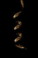
Corkscrewby WallitComment: *not voting as I'm in this challenge-just commenting since I've seen requests for comments in the challenge thread*
Very cool idea, and a great one for this challenge might I add. Execution is laking somewhat though. The blacks in the reflection cause this to be lost some up against the black BG, also all the other stuff going on in the relections are very distracting. I would suggest using either a light tent or painting with light in a very dark room for this sort of object.
HTH |
| Photographer found comment helpful. |
| 09/30/2009 10:40:37 AM |
Geometry of Natureby ConnorComment: *not voting as I'm in this challenge-just commenting since I've seen requests for comments in the challenge thread*
Very nicely done. The placement, sharpness, and border are all working together very well here. My only nitpick(and this is if I'm forced to have one) is the purpleish fuzz or what not in the upper right quadrant. being basic editing it is totally not a hinderance though. Good luck in the challenge. |
| Photographer found comment helpful. |
| 09/30/2009 10:38:08 AM |
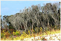
wild thingsby skewsmeComment: *not voting as I'm in this challenge-just commenting since I've seen requests for comments in the challenge thread*
This has some very nice colors and I dig the tilt but I think the sharpening is just too harsh and the blownout areas of the ground drag my eye away from the real focus which should be the trees IMO. the sky is a beautiful shade though and I do like the border as well.
HTH |
| 09/30/2009 10:36:29 AM |
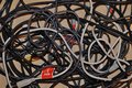
It happens to us all :)by kwhj81979Comment: *not voting as I'm in this challenge-just commenting since I've seen requests for comments in the challenge thread* I like the idea of this. I think it would look less snapshotish if it had a nicer bg then the cardboard. I also think they could have been arranged in an eye pleasing way and still represented the tangled mess scenario we all know too well.
HTH |
| Photographer found comment helpful. |
| 09/28/2009 09:37:59 PM |
|
| Photographer found comment helpful. |
| 09/28/2009 09:36:53 PM |
|
| Photographer found comment helpful. |
Home -
Challenges -
Community -
League -
Photos -
Cameras -
Lenses -
Learn -
Help -
Terms of Use -
Privacy -
Top ^
DPChallenge, and website content and design, Copyright © 2001-2026 Challenging Technologies, LLC.
All digital photo copyrights belong to the photographers and may not be used without permission.
Current Server Time: 04/27/2026 03:00:29 AM EDT.