|
|
|
Showing 941 - 950 of ~1133 |
| Image |
Comment |
| 05/11/2006 12:22:00 AM | A Stitch in Time Saves Nineby xianartComment: Hi Christian -
I scored this one pretty high, a 7. I think it suffered from being too dark for DPC tastes, and from the needle curving around the nine looking more like a scythe - I wouldn't have recognized it as a needle, to be honest, and the shadow blends with it so well that it makes that identification that much more difficult.
However, I definitely appreciate that this photo actually meets the challenge fully, as opposed to many high scoring images that only met it halfway. |  Photographer found comment helpful. Photographer found comment helpful. |
| 05/11/2006 12:15:08 AM | You can't judge a book by its coverby alexgarciaComment: Hi Alex -
I actually love this concept for a cliche photo. Nice choice of subject matter both in the beautiful antique Poe and the Mickey Mouse inside.
Critically speaking, the hands are blown out and blurred. Overall, I would like to see a clear picture throughout in this case. The title doesn't need to be highlighted via DOF as it is now to get the point across. Even if the average viewer doesn't read the cover title, the book itself looks academic and musty enough to convey your idea. | | Photographer found comment helpful. |
| 05/11/2006 12:10:25 AM | Rhythmic Curvesby DigiFotoBuddyComment: Hi Shailesh!
Is it a telephone cord? I can't tell what it is, though I didn't hold this against you in voting. I think what puts me off the most about this is that the red seems oversaturated while the rest has no color at all and I'm puzzled by this choice. It's difficult to say anything about an abstract, however, that isn't just a matter of personal taste. You finished well with it, so good job! | | Photographer found comment helpful. |
| 05/11/2006 12:06:05 AM | Sleep Like a Babyby margiemuComment: Hi Margie!
I've got a couple things on this photo -
First, even though she's your baby and always will be, she's looking more like a toddler for the purposes of fitting into the "sleeping like a baby" cliche. It can be argued that "like" means she doesn't have to be, but photos that need to have a case made for them rarely do well. So it may be that a lot of voters didn't feel that the photo fully met its title - though there are a lot of high scoring photos that only met their titles halfway, so I was probably more strict on this issue than others.
As to the quality of the photo, well, I think the light is wrong. It's natural and I'm sure you didn't want to wake her up, but there's something cold and snapshottish about the blue tones. I would like to see this in a warmer, more golden tone. Also, the crop is too tight. Her head is cut off toward the top of the photo, and her hair at the right. So pull back a bit, warm up the light, and that will make a world of difference. :-) | | Photographer found comment helpful. |
| 05/10/2006 11:56:56 PM | Sinulog Festivalby blackenedwhiteComment: Hi OJ!
I actually scored this an 8 in voting. It's a really cool picture. Maybe the city in the background is a bit overexposed, but we can see everything that you really intended for us to see. Perhaps a bit of a noise issue, but that's really all. The rhythm here is both in the line and in the implied dance, which is a great double entendre for the challenge. :-) | | Photographer found comment helpful. |
| 05/10/2006 11:54:11 PM | The Gift of Loveby OddfrogComment: Hello, Oddfrog from karmabreeze via CTP:M2!
There are two very obvious downfalls to this photo. First being that the image is way too dark, and the second being that the foreground subjects aren't crisply focused. It might be nice to see a little extra light splashed across the gifts, particularly the gold ribbon, which would then have a little sparkle. This would also take the couple further into the background. It also looks like there are some noise issues, which could be easily solved with a light run through Neat Image. (If you don't have it, the demo version is free and since that version only works on photos up to 1024 pixels it works well for challenge entries that are limited to 640.)
I do think, however, that for wedding photography this is a lovely idea. In terms of the challenge, the cliche isn't half bad in matching the photo, which is more than I can say for a lot of higher scoring photos that only met the cliche halfway. | | Photographer found comment helpful. |
| 05/10/2006 12:45:23 AM | Slow As Molassesby ladyhawk22Comment: I'm surprised this didn't score higher. It's a good, clean image that actually meets the challenge instead of relying on the title to meet it halfway. | | Photographer found comment helpful. |
| 05/10/2006 12:39:09 AM | A reason to "Open a Whole New Can of Worms"by cislanderComment: You were totally robbed on this, in my opinion. This was my only 10 vote for the challenge. Not only is it a good photo compositionally, but it actually met the challenge of calling to mine a cliche instead of just meeting it halfway. Ah well, my vote is the only one that counts, right? ;-) | | Photographer found comment helpful. |
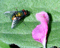
| 05/08/2006 10:31:54 PM | House Flyby nlghttrainComment: Hey there -
This isn't a bad idea, but cropping such a small area from such a large photo rarely works out for the better. The quality just isn't there. Moreover, the light is rather harsh, so toning it down and adding some warmer tones helps a lot. Finally, the subject is just rather blah. DPC is kinda overloaded on so-so flower shots at the moment and the magenta bloom in the photo looks rather sickly.
For what it's worth, here's my workshop. More than anything else I tried to just clean up the house fly. All my steps are listed there. FWIW, the demo version of Neat Image is a free download if you don't already have it.
[thumb]390689[/thumb]
EDIT: The thumbnail button doesn't seem to want to work here.. I'll try posting it on your topic, and if it doesn't like that either, then look in my portfolio under the Workshop folder. ;-) Message edited by author 2006-05-08 22:33:43. |
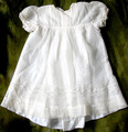
| 05/08/2006 09:43:08 PM | My Grandmother's Christening gown - 1911by xianartComment: Hello from your CTP2 thread!
Irving Penn or no, I think this photo is a little too straightforward to be competitive on DPC. There is such gorgeous detail in the gown that it's a pity the light is so harsh. I would have liked to see a more diffused light and more use of shadow to really bring out the stitch detail.
Also, in a concept challenge like "Something Old", it's never a good sign when you have to tell your audience that the subject is old. The photo should project that concept all on its own. The worn green blanket is a good start, it gives a sort of musty implication, but it just doesn't go far enough. | | Photographer found comment helpful. |
|
Showing 941 - 950 of ~1133 |
Home -
Challenges -
Community -
League -
Photos -
Cameras -
Lenses -
Learn -
Help -
Terms of Use -
Privacy -
Top ^
DPChallenge, and website content and design, Copyright © 2001-2026 Challenging Technologies, LLC.
All digital photo copyrights belong to the photographers and may not be used without permission.
Current Server Time: 06/25/2026 05:24:37 AM EDT.
|