| Image |
Comment |
| 07/09/2006 11:00:36 PM |
|
 Photographer found comment helpful. Photographer found comment helpful. |
| 07/06/2006 03:52:19 PM |
Cat on Glassby MelethiaComment: Hehe, this reminds me of when my former cat Scout was a very mischievous kitten. I used to come home from work every day to find several blank scans had been made with my scanner. It was totally perplexing until I figured out that Scout would get up there to look out the office window. So I started leaving the lid up, and started coming home to scans of orange tabby cat butts, one of which I made into my Livejournal icon for awhile. I still have the series stashed somewhere on my harddrive. Anyway, I gave this an 8. :D |
| Photographer found comment helpful. |
| 07/05/2006 11:57:45 PM |
Exquisiteby swallaceComment: The cool tones you've applied to this are gorgeous. I hope you do well. |
| Photographer found comment helpful. |
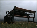
| 07/03/2006 12:52:58 AM |
Some Flowers Bloom no moreby GunnsiComment: Hi Gunnar-
This is quite a clever take on the challenge. It makes me wonder what the man is waiting for. The storm approaching really sets the mood. The exposure is perhaps a touch dark, but overall this is the best you've done lately. |
| Photographer found comment helpful. |
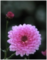
| 07/03/2006 12:51:17 AM |
Ioby GunnsiComment: Hi Gunnar-
The flower is too dark and out of focus, the hue is a little cold. In a challenge like Bokeh where you know there are going to be a million or so flower shots, you really need to make it something extraordinarily special. This might have scored a few tenths higher if it were at least a unique concept, but I think this scored about right overall. |
| Photographer found comment helpful. |
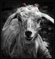
| 07/03/2006 12:46:21 AM |
A Goat's Taleby yankoComment: Hi Richard-
This is a scary looking photo, and to be honest I didn't score it very high since it seemed to me more disturbing and frightening than desolate. Not that it didn't also meet that definition, but it wasn't the first thing that came to mind for me. Also, I don't think that photos that are difficult to look at as this one is tend to do well here. It seemed like a lot of the photos for Desolation suffered from meeting the challenge a little too well. The selective desat on this draws the eyes to the horns rather than to the face, so it's difficult to find a place to rest my eyes in this difficult to look at photo. |
| Photographer found comment helpful. |
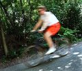
| 07/03/2006 12:37:35 AM |
The Bicyclistby DigiFotoBuddyComment: Hi Shailesh-
I think what hurts this photo most is that the background is too busy. It's the only part of the photo in focus, so we search on it for a place of interest and find nothing, and the biker is there but somehow seems secondary to the leaves. It would work better with a plain background. Also, the lighting is natural, but too white. Shooting when the sun is low in the sky will give an outdoor subject a nice photogenic golden glow. |
| Photographer found comment helpful. |
| 07/03/2006 12:34:14 AM |
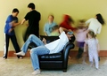
Mom's Day Offby margiemuComment: Hi Margie-
The concept isn't new, but it's still novel enough here to do well. I think it's a brilliant want to depict the perpetual motion of a house full of children and the headache they can cause. Something about the lighting seems slightly off to me, but only just slightly. Look at how white his feet are, the light looks too white. You seem to have found your groove here, congrats! |
| Photographer found comment helpful. |
| 07/03/2006 12:31:03 AM |
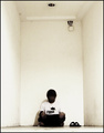
Psychogenic Incorporealityby blackenedwhiteComment: Hi OJ-
I actually liked the minimalism in this one. Image grain and a sort of burnt out quality are quickly becoming your hallmarks. The only thing I can really critique here is that the camera appears to be slightly off center. If you look at the floor and ceiling lines, they're not symmetrical. |
| Photographer found comment helpful. |
| 07/02/2006 08:44:44 PM |
*Ring Ring*by idnicComment: Heh, cute idea! The burning on her arm is a bit too much, and I would prefer to see the top on her head not cut off. Good clarity. The blur looks too touched up. |
| Photographer found comment helpful. |
Home -
Challenges -
Community -
League -
Photos -
Cameras -
Lenses -
Learn -
Help -
Terms of Use -
Privacy -
Top ^
DPChallenge, and website content and design, Copyright © 2001-2026 Challenging Technologies, LLC.
All digital photo copyrights belong to the photographers and may not be used without permission.
Current Server Time: 06/25/2026 10:21:52 PM EDT.