| Image |
Comment |
| 04/21/2006 08:40:03 PM |
|
 Photographer found comment helpful. Photographer found comment helpful. |
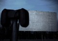
| 04/21/2006 08:37:50 PM |
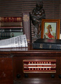
Serving You Since 1933by GivemeashotComment: It took me awhile to figure out what this was.. the big black speaker looming in the foreground is very distracting because it is badly out of focus and yet takes up so much of the frame. I feel like I'm missing half the photo. |
| Photographer found comment helpful. |
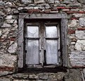
| 04/21/2006 08:35:58 PM |
Forever lockedby DBoyComment: This composition has a lot of potential. Unfortunately it's not very sharp. I probably would have increased the saturation and slightly bumped up the contrast as well (say +5 at most), for a little extra dazzle. |
| Photographer found comment helpful. |
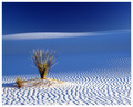
| 04/21/2006 08:32:44 PM |
Sands of Timeby TelehubbieComment: The picture is really lovely, but I think this is really a stretch for fitting the theme. "Old" isn't what comes to mind when I look at this. I would have given it an 8 or 9 if it really nailed the theme. |
| Photographer found comment helpful. |
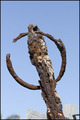
| 04/21/2006 08:28:51 PM |
Rustby racurvComment: There's something blurry at the bottom that is very distracting. I would try this on a square crop and completely eliminate the clutter at the bottom. The pic is also a bit overexposed. I would turn the shutter speed up a notch or try to fix it with some contrast and increased saturation. |
| Photographer found comment helpful. |
| 04/21/2006 08:26:38 PM |
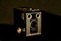
brownieby fordmanf1Comment: It looks very crisp in the foreground, but the background is so dark that the bottom and right edges of the camera are totally lost. |
| Photographer found comment helpful. |
| 04/21/2006 08:25:03 PM |
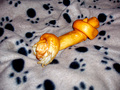
My dog's boneby senojComment: This is "old" how? Besides the dubiousness of whether or not this belongs in this challenge, the photo quality isn't great either. The depth of field on the bone is all wrong, the color looks distorted - it really looks like a very generic bad snapshot. |
| Photographer found comment helpful. |
| 04/21/2006 08:22:16 PM |
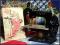
Oh, SEWHANDY!by ralfwComment: I like the idea here, but I think you needed a few warmer-toned light sources coming from several different directions - the shadows cast by the sewing machine are distracting. The light you do have is too white and too harsh for the scene as well, as it washes out the book cover. |
| Photographer found comment helpful. |
| 04/21/2006 08:19:47 PM |
|
| 04/21/2006 08:18:50 PM |
Bendixby codauberComment: A little too much of a snapshot, especially with the flash glare on the Bendix. |
Home -
Challenges -
Community -
League -
Photos -
Cameras -
Lenses -
Learn -
Help -
Terms of Use -
Privacy -
Top ^
DPChallenge, and website content and design, Copyright © 2001-2026 Challenging Technologies, LLC.
All digital photo copyrights belong to the photographers and may not be used without permission.
Current Server Time: 06/24/2026 01:48:36 PM EDT.