| Image |
Comment |
| 10/22/2007 03:56:53 PM |
|
 Photographer found comment helpful. Photographer found comment helpful. |
| 10/22/2007 03:55:56 PM |
Writer's Blockby rbennyComment: I like the composition here and the dof -- very neat. The dark spots in the top left corner are a bit distracting. |
| Photographer found comment helpful. |
| 10/22/2007 02:54:55 PM |
|
| Photographer found comment helpful. |
| 10/22/2007 02:49:40 PM |
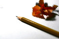
B o o k m a r kby bnileshComment: Oh, the sharpness of that pencil is simply great! Great composition and colors. |
| Photographer found comment helpful. |
| 10/22/2007 02:48:38 PM |
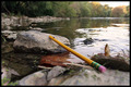
"Lead" The Wayby ejsexComment: Interesting idea but the soft foreground and the light in the water are a bit distracting. |
| Photographer found comment helpful. |
| 10/22/2007 02:47:12 PM |
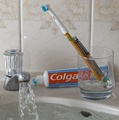
My dentist says that good oral scare is very importantby Blink_Too_FastComment: This is funny! I love the idea! I find the faucet, the sink filled with water and background a bit distracting. The pencil seems a bit too soft. I would have liked to see the composition built around the toothbrush and the toothpaste (and a bit of toothpaste on the brush would have helped, too). |
| 10/22/2007 02:39:06 PM |
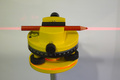
Magic Spirit level pencilby kodelComment: This is funny! You should have sharpened both ends of the pencil, though! This probably would benefit from a bit more brightness adjustments, sharper focus and a different background. :) |
| 10/22/2007 02:36:41 PM |
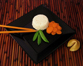
Take Out #2by JerseyGenieComment: Very creative! The food on the place seems a bit soft (looks like you focused on the background). Although the image looks too dark, the rice seems a bit too overexposed on my monitor. I wonder if a different angle (from the top) would have made this a bit stronger of an image. And not sure if the fortune cookie adds anything to the image. Love, love, love the idea! |
| Photographer found comment helpful. |
| 10/22/2007 02:31:21 PM |
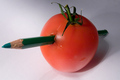
W. Tell was hereby hajekaComment: It should have been an apple instead of the tomato. :) Very creative idea. The light is a bit too harsh and I don't know if the white background adds anything to this photo. The water spot on the tomato is a bit distracting. I wonder if a different angle would have made this photo a bit more interesting. |
| Photographer found comment helpful. |
| 10/22/2007 02:27:19 PM |
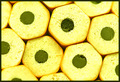
Honeycomb?by CJinCAComment: Great idea. Don't care too much for the color -- looks too yellow on my screen. I wish they were arranged a bit more neatly, so that focus is consistent throughout. |
| Photographer found comment helpful. |
Home -
Challenges -
Community -
League -
Photos -
Cameras -
Lenses -
Learn -
Help -
Terms of Use -
Privacy -
Top ^
DPChallenge, and website content and design, Copyright © 2001-2026 Challenging Technologies, LLC.
All digital photo copyrights belong to the photographers and may not be used without permission.
Current Server Time: 07/19/2026 03:38:45 PM EDT.