| Image |
Comment |
| 04/18/2002 09:08:00 AM |
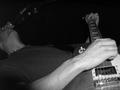
the big riffby heartsdivideComment: Better not rotated 90° CW. Not the greatest use of negative space, but okay. Right side (top) needs some flash, too. Looks like the flash auto sensor was tricked by the glare from the pickup. |
| 04/18/2002 08:28:00 AM |
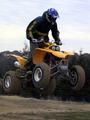
Jump!by pashbokComment: A fill flash would have worked well here to get more detail in the rider and under the bike. The dark rider against the bright sky / bright bike against the dark hills works real good. |
| 04/10/2002 10:46:00 AM |
|
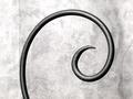
| 04/10/2002 10:19:00 AM |
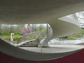
The Whirlpoolby SeirComment: A very interesting idea. Wish I could see the bottom of the funnel, though, and more controlled reflections / better light. A vertical might work better here. |
| 04/10/2002 10:44:00 AM |
|
| 04/10/2002 10:12:00 AM |
|
 Photographer found comment helpful. Photographer found comment helpful. |
| 04/10/2002 10:40:00 AM |
|
| Photographer found comment helpful. |
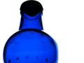
| 04/10/2002 10:34:00 AM |
Bottledby mciComment: Cool. Maybe good to see a little more room on top, and not quite so much space to the right. I'd have turned the bottle to avoid the code at L. Very nice clarity and color. |
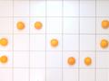
| 04/10/2002 10:43:00 AM |
A Sinewave Orangeby PauloComment: Good idea. Better with the tiles squared off and with a little more room on the sides. |
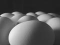
| 04/10/2002 10:01:00 AM |
Eleven by connieComment: 8 is a much curvier number. So's nine. Love the photo. Slightly dark from here. |
Home -
Challenges -
Community -
League -
Photos -
Cameras -
Lenses -
Learn -
Help -
Terms of Use -
Privacy -
Top ^
DPChallenge, and website content and design, Copyright © 2001-2026 Challenging Technologies, LLC.
All digital photo copyrights belong to the photographers and may not be used without permission.
Current Server Time: 07/16/2026 06:38:26 AM EDT.