| Image |
Comment |
| 05/09/2002 04:29:00 AM |
|
 Photographer found comment helpful. Photographer found comment helpful. |
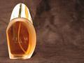
| 05/10/2002 12:30:00 AM |
Realmby shortredneckComment: "Ream Womin"? The composition is okay, except that the bottle really ought to face into the frame instead of out. Lighting could be much better - the cap is just a mess of reflections and hotspots. This kind of thing - chrome and glass - is very hard to do, but I think you could do better than this even without studio gear. Try some white foam core to take control of the light and reflections next time. Also seems oversharpened. |
| 05/10/2002 12:51:00 AM |
Dog ate your homework?by defrostedComment: I'm guessing that this is a Jansport parody. You can get away without a logo here thanks to the suede bit. Poor Scooby! Don't mind the blown bg, but wish it didn't spill over onto the bag. |
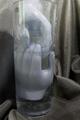
| 05/09/2002 04:47:00 AM |
ABSOLUT drownby censuraComment: Interesting subjects and arrangement, but doesn't really follow the Absolut theme without the bottle. Holding a white card between the lightsource and the glass might have toned down those reflections, and another angle would probably be more interesting. |
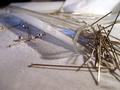
| 05/09/2002 04:21:00 AM |
salt that stingsby ritaardComment: I'm guessing the title is the tag line of an ad I haven't seen. Assuming that, it's very, very good photography. OOF foregrounds usually bother me, but in this case it just makes the point of that one needle that much closer to my eye. You might have panned right just a bit to include more of the needles / less of the not so perfect background. Can't wait to find out what this one is for. |
| 05/11/2002 04:13:00 AM |
|
| 05/10/2002 01:57:00 AM |
|
| 05/10/2002 12:45:00 AM |
Listen to 94.9ZHTby snoopyComment: The way the flash worked on the lettering is interesting, a little, and there's a bit of sunrise or sunset reflected in the window (albeit with utility lines and poles). Don't see much else to recommend this, though. |
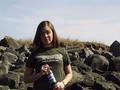
| 05/11/2002 04:02:00 AM |
What's better on a warm summer day?by Palli747Comment: Pretty girl and a nice setting. The hard side lighting would be improved with some fill, or a reflector, or turning the whole scene so the subjects faced in to the sun. I'd have asked her to hold the bottle with more of the logo on the label showing, as well, and maybe used a bottle with more Pepsi inside. Do they really have green labels, or is that a WB issue (I live at the edge of the earth)? |
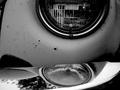
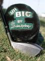
| 05/10/2002 01:00:00 AM |
Mr. Bigby bruster54Comment: If you'd found a patch of open shade you could have avoided the overexposure on the head of the driver and cover logo, and the colors might have snapped a little better. The patch of grass you chose doesn't look too well tended, and the white glare at R of the bg and dark area at L (interferes with the shaft) are unfortunate. It's a good composition, but would have benefited from a bit more care in the execution. |
Home -
Challenges -
Community -
League -
Photos -
Cameras -
Lenses -
Learn -
Help -
Terms of Use -
Privacy -
Top ^
DPChallenge, and website content and design, Copyright © 2001-2026 Challenging Technologies, LLC.
All digital photo copyrights belong to the photographers and may not be used without permission.
Current Server Time: 07/16/2026 04:59:19 PM EDT.