| Image |
Comment |
| 05/13/2002 10:33:00 PM |
|
| 05/18/2002 02:33:00 AM |
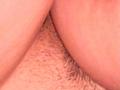
"Upside" by Daniel Towseyby danieltowseyComment: You've only used 1/3 of the allowable file size, and the compression really shows. Having some trouble a) knowing what I'm looking at (aside from being sure it's anatomical and partially hairy - better clarity and less compressino would help here) and b) understanding how it relates to the challenge. Possibly a more interesting abstract in B/W to even out the skin tones a bit. |
| 05/14/2002 04:30:00 AM |
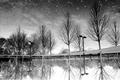
Coins in the Sky by zaynoComment: This, IMO, is the rotated reflection pic that works. Nicely composed, good choice of B/W, and the water makes a great sky. |
| 05/10/2002 12:35:00 AM |
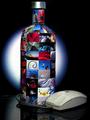
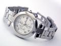
Make Your Fantasies Realby ReignComment: So... didja buy the cuffs and cat-o-nine-tails especially for this image, or were they already in the nightstand? Very clever, and nicely laid out. Exposure is a bit dark and shows a little color cast and shadow at the top of the bottle, but not too far off. Nice work. |
| 05/06/2002 11:35:00 AM |
|
 Photographer found comment helpful. Photographer found comment helpful. |
| 05/11/2002 04:21:00 AM |
Absolut DPChallengeby AleciaComment: Good concept, but you could have followed through a bit better in the execution. Getting the photos stuck on the bottle was probably work, but I'd have tried to do a neater job if I were going to bother. Your mouse is nearly as dirty as mine. The devil's in the details, ain't it? |
| 05/10/2002 01:03:00 AM |
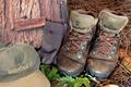
Walk a few thousand miles in our shoes.by CoreyComment: Too many elements / logos, IMO. Looks more like a shop window display than an ad photo. Toss the box and sox for sure. Those boots have loads of character. Maybe getting in close on them with the needles and leaves for a bg would have been more effective. Not bad, but could be better. |
| Photographer found comment helpful. |
| 05/09/2002 04:08:00 AM |
|
| 05/11/2002 03:57:00 AM |
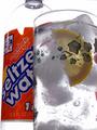
Soda Water Ad: Cool Clean Refreshment!by magnetic9999Comment: The glass is very nicely done (althouh it would be better, IMO, with a little frontal lighting to keep the lemon from going so dark), but that bottle... half(?) empty and with a torn label isn't the most appealing. |
| 05/10/2002 12:38:00 AM |
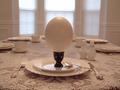
Jumbo Eggs: It's What's for Breakfastby MaYzComment: That's one big egg. I think a hgher, more level camera position would have helped the composition. My eyes get pulled away from the foreground, and I can't remember the last time I saw a table setting from this low a perspective. The glare from the window caused the interior to underexpose a little, and you got some noise on the egg and in the walls as a result. |
Home -
Challenges -
Community -
League -
Photos -
Cameras -
Lenses -
Learn -
Help -
Terms of Use -
Privacy -
Top ^
DPChallenge, and website content and design, Copyright © 2001-2026 Challenging Technologies, LLC.
All digital photo copyrights belong to the photographers and may not be used without permission.
Current Server Time: 07/16/2026 08:32:12 PM EDT.