|
|
|
Showing 411 - 420 of ~707 |
| Image |
Comment |
| 05/26/2002 01:59:00 AM | Dominoesby shortredneckComment: Since there isn't much color here to begin with, I think B/W would have been a good choice. Composition doesn't really lead the eye to any center of interest, and the on-camera flash put those irritating highlights in the wells on the dominoes. |
| 05/21/2002 10:19:00 AM | Domino Effectby TiggarrooComment: One recommendation I like to make is that people take some heavy cardboard and permanently glue it over their built-in flash (that or just never use it again). It's a nice setup, but would be so much more interesting if you used a desk lamp or some window light instead. |
| 05/25/2002 03:21:00 AM | |
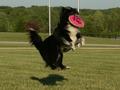
| 05/25/2002 01:37:00 AM | My Old Dog's Tricksby lecalanComment: Nice catch, both of you. Did you throw the frisbee, too? The timing and catch of the dog's shadow are great, and it looks like the perfect shutter speed for this - just a little blur in the boving fur to show motion, but the eye (with highlight!), teeth, etc. all nice and sharp. The flagpoles detract, and there's a yellow cast. LIke many photos here, this could use a positive gamma adjustment to bring out a little detail in the shadows. With a little editing, this would make a good one for your wall. |
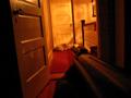
| 05/21/2002 10:17:00 AM | domestic game huntingby jonathansComment: Is that a cat's paw holding the rifle? A bit noisy from underexposure, but what can you do in the dark? Maybe a little more care in composition (dog on white something looks kind of like two dogs, something at base of railing interferes with the barrel), but I like the tilt. |
| 05/26/2002 02:15:00 AM | |
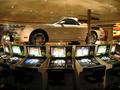
| 05/25/2002 02:51:00 AM | Win a carby bobgaitherComment: Good exposure in a tough situation. Did you have to get permission to shoot there? Signpost detracts, but I don't guess there was much you could do about it. |
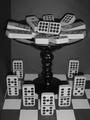
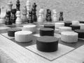
| 05/25/2002 02:28:00 AM | Turf warby liltoolComment: Interesting idea. Composition is a little tight at the top. I'd have shot at a slightly higher angle to give the chess pieces some more room and avoid the oof leading edge of the board. BG (carpeted wall?) is too busy, IMO. More contrast would be good to take advantage of the B/W. |
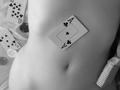
| 05/21/2002 10:22:00 AM | Strip Pokerby KimblyComment: It's a no-lose situation. Nice tones, and a wonderful navel. The angle (ref. the 5 of clubs) is a little dizzying. Shirt is a nice touch. |
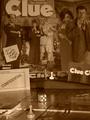
| 05/26/2002 02:24:00 AM | you sunk my battleshipby eyegoComment: Macro, IMO, ought to be sharper than this. The center of the board rather than a corner might have been more effective, as well. Why red? |
|
Showing 411 - 420 of ~707 |
Home -
Challenges -
Community -
League -
Photos -
Cameras -
Lenses -
Learn -
Help -
Terms of Use -
Privacy -
Top ^
DPChallenge, and website content and design, Copyright © 2001-2026 Challenging Technologies, LLC.
All digital photo copyrights belong to the photographers and may not be used without permission.
Current Server Time: 07/17/2026 03:50:20 AM EDT.
|