|
|
|
Showing 291 - 300 of ~707 |
| Image |
Comment |
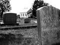
| 06/05/2002 06:48:00 AM | Minnie L. Cookseyby BAMartinComment: At another time of day, when the headstones aren't backlit, I think you'd have a better look. I can make out some lettering in the far R stone, but it still strikes me as too dark. Compositionally, I'm not very happy with the way Minnie is 'looking' out of the frame. |
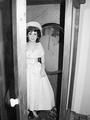
| 06/06/2002 12:21:00 PM | Stepping Outby maknbaconComment: Eerily compelling. The door draws my attention in the fg, as if it's just swung open, and there's the thing that answered, looking at the detective to my right and slightly startled by the lamp on my video camera.. I zoom in tighter on its head and the portrait in the background. It replies to the detective, "But I *am* Mrs. Rowan..." Raising your score on second look. |
| 06/05/2002 06:45:00 AM | The Patriotby daclozerComment: Nicely done - good contrast, nice deep DOF to show some detail in the bg headstones. Personally, though, the flower looks very odd to me placed that way and with such a long stem. Don't know if you need it. |
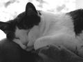
| 06/04/2002 05:25:00 AM | Lounging Aroundby PaulinaRDComment: Good B/W (an all photography, really) is all about light, and the ugliest light known to man (except possibly flourescent) is, for some reason, built into most cameras. It's very hard and directional, which flattens textures, and casts horrid shadows nine times out of ten. You could possibly adjust the gamma (middle gray value) here to improve the range of contrast. |  Photographer found comment helpful. Photographer found comment helpful. |
| 06/04/2002 03:04:00 AM | Please Don't Go To Workby jennymaComment: Good B/W (an all photography, really) is all about light, and the ugliest light known to man (except possibly flourescent) is, for some reason, built into most cameras. It's very hard and directional, which flattens textures, and casts horrid shadows nine times out of ten. You'd have been better off shooting in the available room light or finding a way to get more light without using the built-in flash. Compositionally, the dog is surrounded by distracting tables and chairs, and the plastic whatisit on the sofa caught some bad reflections. |
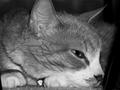
| 06/04/2002 02:39:00 AM | B&W Dreamingby jimsappComment: Lots of people have fallen into this B/W trap - while your image, as a whole, has a good dynamic range (black blacks, white whites) the subject itself shows much less contrast. My eye is drawn away from the cat to the bright white of the background. |
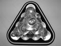
| 06/04/2002 05:30:00 AM | Lucid Pyramidby jaxxComment: Focus seems best on the second tier of lights from the ceiling, which makes for a big, oof area right in the center of your composition. Personally, I've never much cared for the "light fixture from below" thing, but the other one in this contest is worth a look. |
| 06/05/2002 11:20:00 AM | trouble pokes you in the eyeby PrestonMayhemComment: Very eye-catching - good take on the ol' eye macro. Just a suggestion, I like it cropped down to juuust above the eyebrow with a little off the L side - just a little more 'in your face'. Slightly brighter, please. |
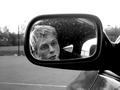
| 06/04/2002 05:55:00 AM | How do I look ?by hixxxComment: You could probably crop top and left to lose some of the dull bg and distracting, blown out sky. Nice contrast. Looks like the focus is just behind the mirror, judging from what's visible of the door panel. |
| 06/06/2002 12:46:00 PM | | | Photographer found comment helpful. |
|
Showing 291 - 300 of ~707 |
Home -
Challenges -
Community -
League -
Photos -
Cameras -
Lenses -
Learn -
Help -
Terms of Use -
Privacy -
Top ^
DPChallenge, and website content and design, Copyright © 2001-2026 Challenging Technologies, LLC.
All digital photo copyrights belong to the photographers and may not be used without permission.
Current Server Time: 07/16/2026 08:35:21 PM EDT.
|