| Image |
Comment |
| 06/06/2002 12:51:00 PM |
|
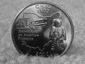
| 06/06/2002 05:55:00 AM |
cactusby djbdjComment: A good subject, and pretty good contrast. I wouldn't mind some pure white, as well. Might have been more effective to isolate just one part of the cactus, but that's another image. Nicely done. |
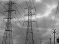
| 06/05/2002 11:38:00 AM |
X-Rayed!by pablettoComment: Nice, fine grain - just enough for crunch. Why not a vertical comp? I like the light, but don't need to see the source at R. Might tone down the highlight just a little. At least the bg is B/W. |
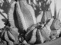
| 06/06/2002 06:58:00 AM |
poweplayby queen 91Comment: The blacks in the power poles could be a little denser, and it's a shame about the foliage at R. Maybe a vertical composition would have been better. Could you have moved to catch more of that great light at UR? |
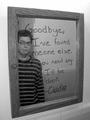
| 06/06/2002 12:48:00 PM |
Dear John. . .by blueeyedemoboyComment: Looks like he's thinking, 'My *mirror*! Damn you , Claudia...' A little tough to read against the shirt. |
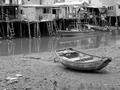
| 06/05/2002 11:47:00 AM |
Old Deserted Boatby terrentiusComment: I like this better with the left side off to make a vertical comp. You'd lose the white XXX on the bank and that stern rope, too. I like the open shade in the fg in contrast with the bright sun on the rooftops, for some reason. Nice work. |
| 06/10/2002 12:50:00 AM |
G-Stringsby simtengleongComment: You were robbed. It's a shame that people who don't know what they're looking at can't keep an open mind. |
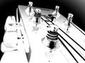
| 06/05/2002 06:40:00 AM |
G-Stringsby simtengleongComment: Just have to break from my "from the ground up" commenting scheme to acknowledge my three favorites. This is an excellent piece of work. The inversion gives the tuning pegs a great chromed look. I guess I'd like the fg in better focus, but you get high marks from me on impact. Congratulations! |
| 06/04/2002 02:51:00 AM |
Ying & Yangby zerplordComment: Hard to tell, but I think the lighting might have been flat on the day you were shooting. The image has been given adequate contrast overall, but the whites have mostly been soaked up by the wall in the bg, leaving the dogs looking a bit flat. Possibly some camera shake or a focus issue, as well. Most of the time, B/W needs to be tack sharp. |
| 06/04/2002 11:48:00 PM |
Magnoliaby elemessComment: Increasing the brightness a little more would give a nicer range of contrast in the flower (at least on my somewhat calibrated monitor). The very center, in particular, would be improved through greater visible detail. |
 Photographer found comment helpful. Photographer found comment helpful. |
Home -
Challenges -
Community -
League -
Photos -
Cameras -
Lenses -
Learn -
Help -
Terms of Use -
Privacy -
Top ^
DPChallenge, and website content and design, Copyright © 2001-2026 Challenging Technologies, LLC.
All digital photo copyrights belong to the photographers and may not be used without permission.
Current Server Time: 07/16/2026 02:27:26 PM EDT.