| Image |
Comment |
| 01/24/2003 10:06:27 PM |
|
 Photographer found comment helpful. Photographer found comment helpful. |
| 01/24/2003 09:59:44 PM |
|
| Photographer found comment helpful. |
| 01/24/2003 09:56:31 PM |
Slight Turn Aheadby xertionComment: Nice color and clarity. Possibly better with the diagonal of the hill not directly behind the sign. |
| Photographer found comment helpful. |
| 01/24/2003 09:52:24 PM |
lonely roadby imagesloyolaComment: Interesting. Is that sign in Arabic? I really like the curve of the road, and the way the sign and lamps lean into the frame. The road leading toward whatever's under that hotspot in the sky works for me, too. Would like to see this bigger, though, and a little less grainy if possible (although the graininess is consistent with the feel of the pic). |
| 01/24/2003 09:45:05 PM |
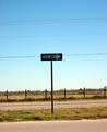
One way or the highwayby billypComment: There's something to be said for keeping the composition simple and the content minimal, but I think you'd have done better to exclude more of the background here. I like the fence and the sign, but the power lines are a major distradtion. |
| 01/24/2003 09:40:55 PM |
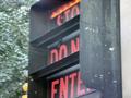
pay attentionby MagsCoyoteComment: This looks like it was taken through the window of a moving bus or train. A crop to exclude the background at L and the bit of wall (?) at R would be a good start, followed by a dose of auto levels to give it some snap. |
| 01/24/2003 09:36:47 PM |
|
| 01/24/2003 09:33:25 PM |
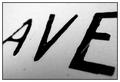
Avenueby mciComment: Tasty. This is the image that's sticking in my mind in this competition. Great approach to the challenge. One nit: since you don't have any pure white in the image, I'd avoid a white border. All black would look better. |
| Photographer found comment helpful. |
| 01/24/2003 09:30:20 PM |
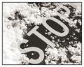
Plowed Overby connieComment: On second viewing, this needs a higher score. Very nice B/W with good story. Compositionally, I'd like the see the S just a little bit higher, but that's small potatoes. Very fine. |
| 01/24/2003 09:27:27 PM |
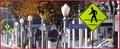
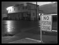
No Pedestrian Crossingby bdshortComment: Very nice tones, and a good, desolate feeling. Plenty of depth for that walk-into-the-picture feeling (especially tasty irony w/r/t the sign). The top feels a little too tight to me, and the white border aggravates the problem. |
Home -
Challenges -
Community -
League -
Photos -
Cameras -
Lenses -
Learn -
Help -
Terms of Use -
Privacy -
Top ^
DPChallenge, and website content and design, Copyright © 2001-2026 Challenging Technologies, LLC.
All digital photo copyrights belong to the photographers and may not be used without permission.
Current Server Time: 07/16/2026 06:23:05 PM EDT.