| Image |
Comment |
| 01/30/2003 12:00:40 AM |
Let Your Fingers Do The Walking...by dougmc1Comment: so tiny... the diagonal composition and choice of B/W work here, but the dark tones could use some reinforcement and a more interesting light source than onboard flash is in order. |
 Photographer found comment helpful. Photographer found comment helpful. |
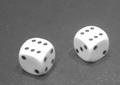
| 01/29/2003 11:58:33 PM |
luckythrowby desmckechnieComment: If I were you, I'd take that overexposure on the tops of the dice and run with it. If you've got software with the capability, adjust the left side of the levels slider to make the tabletop and the markings on the dice almost pure black. Otherwise, just jack up the contrast. It won't overcome the soft foucs or less-than-spectacular subject, but it will pull what pop there is out of the image you have. |
| Photographer found comment helpful. |
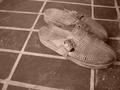
| 01/29/2003 11:55:24 PM |
ethnoby andlbComment: You've shown a good instinct as far as choosing B/W for this image. The textures and patterns are best presented without the distraction of color. Unfortunately, there are several aspects of good B/W that are missing here. The most important is light. The lighing here is very flat and non-directional. It doesn't make any strong shadows across the image or help to bring out the texture of the shoes. A massive boost in contrast might help a little here, but without good light to begin with there's only so much you can do. The composition, while adhering to the "rule" of thirds, is (IMO) too loose. I know that it was improtant to include the tiles for the square (rectangular?) part of the challenge, but they really don't add anything to the composition. A tighter crop would put the focus on the shoes. Finally, while I'm a fan of found still life, there's something to be said for washing down the front porch occasionallly. The dust and shoe prints are distracting. Hang in there. |
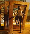
| 01/29/2003 11:48:08 PM |
Jumping through squaresby jab119Comment: You've set yourself a doubly difficult task here; night photography and OPA (other people's art). As to the first, it's not bad. I'm not wild about the shadows produces by what looks like sodium vapor lighting on the statue, but given the mixed lighitng your colors aren't too far off and the camera was held still enough for a clear image. My personal feeling about OPA, though, is that a photograph of someone else's work really needs to add something to the original to be worthwhile. I just can't see that you've accomplished that here. This is a perspective available to anyone wallking by this sculpture (why from the back, anyway?). From above, or below, or some other unique perspective is the only way (IMO) to make something like this work. |
| 01/28/2003 12:39:00 PM |
|
| Photographer found comment helpful. |
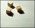
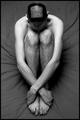
| 01/28/2003 12:30:06 PM |
Square competition gone to my head.by SharQComment: Bonus points for dedication. Great tones and light. I know getting the camera up higher would have been difficult, but it would have allowed you to put more compositional emphasis on the head. Very fine. |
| Photographer found comment helpful. |
| 01/28/2003 12:16:38 PM |
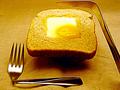
Square Mealby BullwinkleComment: Interesting image. What strikes me immediately is the way the toast is levitating above the tablecloth, reinforced by the position of the knife. Is there a reason for this? It's attention getting, but a little unclear w/r/t intent. Some white balance and sharpness issues, but good work. |
| Photographer found comment helpful. |
| 01/27/2003 11:16:12 PM |
|
| Photographer found comment helpful. |
| 01/27/2003 11:14:50 PM |
|
| Photographer found comment helpful. |
| 01/27/2003 11:12:28 PM |
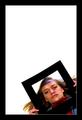
Beadedby GraciousComment: Nice colors, and kudos for the border. Needs something (square) inside to finish it off. |
Home -
Challenges -
Community -
League -
Photos -
Cameras -
Lenses -
Learn -
Help -
Terms of Use -
Privacy -
Top ^
DPChallenge, and website content and design, Copyright © 2001-2026 Challenging Technologies, LLC.
All digital photo copyrights belong to the photographers and may not be used without permission.
Current Server Time: 07/16/2026 11:11:51 PM EDT.