| Image |
Comment |
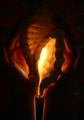
| 03/24/2006 02:49:06 PM |
Secret Offeringby pineappleComment: The light appears liquid as it flows from the bottom of the shell and down her arms. And when going beyond the obvious a whole second image appears... |
 Photographer found comment helpful. Photographer found comment helpful. |
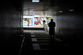
| 03/24/2006 02:45:14 PM |
Tunnelby Serdar_SariComment: I'd have liked the man a little farther either direction, more against the wall or against the bright, to avoid the wall line running into his head. Probably back, because his sharp silhouette draws my eye. |
| Photographer found comment helpful. |
| 03/24/2006 02:39:05 PM |
Ninja Wannabeby pandersoComment: With the large object (foot) out of focus it distracts from the eyes, which are the great part. |
| Photographer found comment helpful. |
| 03/24/2006 02:35:45 PM |
First Sign of Springby rjpatComment: It reminds me of something from an old book. Normally we want to see daffodils pop with brightness but I like this. Personally, I wish I could see a little more of the vase. The lines are so flowing that my eye keeps trying to follow and isn't allowed to go far. But then we'd lose detail in the flowers if you pulled back, and I like that too. Okay, I guess that means it's good, if I want to see more, right? |
| Photographer found comment helpful. |
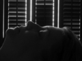
| 03/24/2006 02:28:25 PM |
Sleeping beautyby ClayaComment: Good job in getting the contours on the face. Maybe taping some gauze on the back of the shutters would have cut the intensity a bit, given you better control on the light. Also, centering the face diminishes the interest some. I'm new to this style, and found that it's certainly not as easy to obtain as it looks! |
| Photographer found comment helpful. |
| 03/24/2006 02:15:07 PM |
|
| Photographer found comment helpful. |
| 03/24/2006 02:12:50 PM |
Predatorby gotrondComment: Too minimalistic for my taste. I like the idea, but with a little more crop. |
| Photographer found comment helpful. |
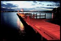
| 03/24/2006 05:30:00 AM |
The Dock at Duskby BanksonComment: For my taste, a little too sharply contrasted and saturated for the subject. I do really like the composition and scene though, and look how straight that horizon is! Overall, very nice image. |
| Photographer found comment helpful. |
| 03/24/2006 05:25:25 AM |
Black Lightsby PlanetMakerComment: Great car, sharp, clear photo, but it looks pretty allover bright to be called lowkey |
| 03/24/2006 05:21:15 AM |
|
| Photographer found comment helpful. |
Home -
Challenges -
Community -
League -
Photos -
Cameras -
Lenses -
Learn -
Help -
Terms of Use -
Privacy -
Top ^
DPChallenge, and website content and design, Copyright © 2001-2026 Challenging Technologies, LLC.
All digital photo copyrights belong to the photographers and may not be used without permission.
Current Server Time: 07/18/2026 02:45:14 AM EDT.