| Image |
Comment |
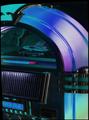
| 03/10/2004 09:48:36 AM |
Rock Legendby spydrComment: Beautiful shot, but I'm distracted by the apparent tilt adjustment that's highlighted by the frame. |
 Photographer found comment helpful. Photographer found comment helpful. |
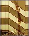
| 03/10/2004 09:47:34 AM |
Crane Reflectionsby dsidwellComment: Beautiful and creative. One of the better shots I've seen so far in the challenge. The only thing I'm not crazy about is the color cast. 8 |
| Photographer found comment helpful. |
| 03/10/2004 09:46:31 AM |
metallurgical engineering at nightby ursulaComment: Holy cow - we've got a winner! Beautiful image. I'm a huge fan of industrial night shots. This conveys all kinds of motion in that flowing steam and is absolutely beautiful to look at. 10 |
| Photographer found comment helpful. |
| 03/08/2004 11:01:12 AM |
Unpluggedby labudsComment: Phenomenal colors and lighting, as well as composition. Very eye-catching. I suspect this will do very well in the challenge. 10 |
| 03/03/2004 12:19:11 PM |
|
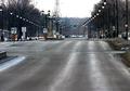
| 03/03/2004 11:41:48 AM |
TO THE RIGHTby Rando D300Comment: Extremely well composed. Although there are all kinds of elements working in this photograph, you've found a way to quiet them down by using a nice wide angle and lots of the pavement, as well as the lines formed by the lights to help contribute to the "silence" of the image. Nice work. |
| Photographer found comment helpful. |
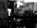
| 03/03/2004 11:39:50 AM |
finally quiet caféby KainnonComment: There are an awful lot of elements to this photograph - even without patrons, the cafe still seems "busy" due to elements everywhere in the frame, compounded by the reflections we're seeing on the glass you apparently took this through. Distracts from the feeling of "silence". |
| 03/03/2004 11:34:33 AM |
The sound of Silenceby RegoComment: Your framing, composition and idea are all good, but the overexposure on the face is too distracting. |
| 03/03/2004 10:54:22 AM |
|
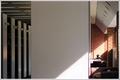
| 03/03/2004 10:49:44 AM |
The Libraryby flip89Comment: Very creative composition. I love the solitude you've captured by having a lone figure on the right, balanced by the bookshelves on the left. Normally, the chunk of wall in the middle would be a little too weird, but the fact that the sunlight cuts across and joins it to the right side of the frame makes it all work very well together. Great work - don't be surprised or too disappointed if a lot of people here don't "get" it, though. It's very artistic and the voting public doesn't always consider the concepts of composition and art as much as they look for a "wow" factor. 9 |
| Photographer found comment helpful. |
Home -
Challenges -
Community -
League -
Photos -
Cameras -
Lenses -
Learn -
Help -
Terms of Use -
Privacy -
Top ^
DPChallenge, and website content and design, Copyright © 2001-2026 Challenging Technologies, LLC.
All digital photo copyrights belong to the photographers and may not be used without permission.
Current Server Time: 07/25/2026 01:03:04 AM EDT.