| Image |
Comment |
| 05/07/2003 12:12:53 PM |
Fill it upby PaigeComment: I really like the angle and the high-key effect. It might be more "fun" if there was a dramatic splash, but overall a good shot. |
 Photographer found comment helpful. Photographer found comment helpful. |
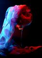
| 05/07/2003 11:34:05 AM |
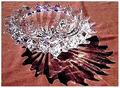
Cascadeby AleciaComment: Interesting set up, lighting, subject, and good saturated colors against the black background. The only thing I find distracting are the wrinkles in the material. Good work on the creative aspect, though. |
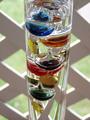
| 05/07/2003 11:28:30 AM |
Floating Glass Ballsby ReneeComment: There was a really good shot of a Galileo thermometer in a challenge a while back. It was centered diagonally in the frame to create a strong dynamic composition. As this is, I find the background a bit distracting, and don't care for the centered placement of the subject. It's a beautiful subject, and I think with a bit more creativity, this could have been a winner. |
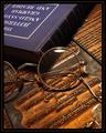
| 05/07/2003 11:21:33 AM |
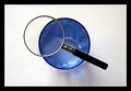
The Professorby jmsetzlerComment: Gorgeous tones... This would work well in a library, a fancy den, or even an optometrist's office. Absolutely beautiful work. Creative idea to use a pair of glasses. 10 |
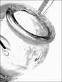
| 05/07/2003 11:17:12 AM |
Bottled Lightby scrooslooseComment: Nice composition and use of non-distracting background. I'd like to see the focus shifted more to the mouth of the bottle, perhaps. I like the little drops that appear to be some sort of condensation on the bottle itself, they add a texture and interest to the shot. So maybe just a bit tighter on the aperature to bring the whole thing into sharp focus? Just a thought... |
| Photographer found comment helpful. |
| 05/07/2003 11:05:57 AM |
Nature's Fire (Abstract)by LeahStephenComment: I really like your use of the shadow in the composition, as well as the sparkles of light on the glass itself. I tend to find the high contrast a bit distracting, however. While it brings out the highlights, you are losing a lot of detail that might add interest to the shot. Creative, though, and quite pretty. |
| Photographer found comment helpful. |
| 05/07/2003 11:02:52 AM |
Diversityby ChezComment: Fantastic. Composition is perfect, and I like the creative 2nd level you've taken this to. 10 |
| Photographer found comment helpful. |
| 05/07/2003 11:01:29 AM |
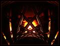
Infernoby mariomelComment: Very effective and interestng use of lighting. I like the shots in which people used the properties of glass to achieve creative effects. Nice work. |
| Photographer found comment helpful. |
| 05/07/2003 11:00:19 AM |
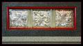
Decorative Bricksby GeneralEComment: Interesting shot. Very "fine art". I'm not sure that I like the lighter line running across the bottom... Actually, upon closer inspection, I do like the lighter line, it's the line below it of the darker color that I don't care for. I think with the lighter color at the bottom, it's still simple enough that the centering works well and you're effective in the minimalist feel that this has, but the little bit of dark makes it busier, and it doesn't work as well. Of course, that's just me... Maybe I'm reading too much into it and I should just go get another cup of coffee. :) 8 |
| Photographer found comment helpful. |
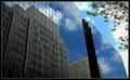
| 05/07/2003 10:48:50 AM |
Side Effectsby casualguyComment: Great idea! Technically very well done, also. The building's placement in the composition is perfectly balanced by the placement of the reflection on the building. (Hope that makes sense) The tree and clouds are also a nice touch, contrasted against the straight lines of the building. Congrats. I don't see how this could be better. 10 |
Home -
Challenges -
Community -
League -
Photos -
Cameras -
Lenses -
Learn -
Help -
Terms of Use -
Privacy -
Top ^
DPChallenge, and website content and design, Copyright © 2001-2026 Challenging Technologies, LLC.
All digital photo copyrights belong to the photographers and may not be used without permission.
Current Server Time: 07/17/2026 02:04:08 PM EDT.