| Image |
Comment |
| 04/13/2006 08:42:48 PM |
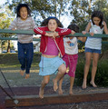
getting higherby MichaelCComment: nice, but a little too scapshotty. cropping the bottoma bit to lose the ground under the beam might help, as well as the left side. darkening hte background would also help. the flash light is a little harsh - it might have been nice with ambient light and a bit of motion blur. |
 Photographer found comment helpful. Photographer found comment helpful. |
| 04/13/2006 08:40:36 PM |
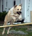
Jump, Nippin, Jumpby jorrComment: a nice idea, but the lack of focus and the harsh flash light let you down. well cropped and composed. if the background were darker, that would also help. |
| Photographer found comment helpful. |
| 04/13/2006 08:39:30 PM |
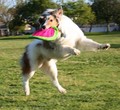
Jump!by ralfwComment: it could be nice, but the poor focus lets you down. ideally, the dog would be in sharp focus, and the background (which is a bit cluttered and distracting) would be in deep unfocus (yeah, i know it's not word...). |
| Photographer found comment helpful. |
| 04/13/2006 08:32:49 PM |
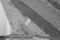
Vertigoby marvinComment: what a great idea. it does give me vertigo, just looking at it. however, the tones are a little flat, i'd like it more if it had the full tonal range. 5 |
| Photographer found comment helpful. |
| 04/13/2006 06:54:44 AM |
5/30by PedroComment: excellent! startred my day with a smile. |
| Photographer found comment helpful. |
| 04/12/2006 06:25:15 AM |
|
| Photographer found comment helpful. |
| 04/10/2006 03:12:49 PM |
Save The Life Of My Childby GeneralEComment: such a good idea, but really let down by the quality of the image. if the lighting was a bit better, or the contrast, or the levels. i think it really needs to be reshot, with a tiny bit of bounce on the underside of the shoes, to show what they are, and framd to avoid the hand? on the right side. keep trying with this, you're onto a good one! |
| Photographer found comment helpful. |
| 04/10/2006 03:06:52 PM |
|
| Photographer found comment helpful. |
| 04/07/2006 08:34:38 PM |
|
| Photographer found comment helpful. |
| 04/05/2006 10:37:56 PM |
primary focusby bikefreakComment: Originally posted by xianart:
my god this is stunningly annoying. i take it it's supposed to be? i love the colours though. very brave. |
just to let you know, i gave you a 6 on this. and i agree, it would be beter on a large scale. it does kind of do my eyes in on the monitor...
i do apologise for sounding rather rude in my first comment. i was trying to be flip and humourous. didn't work, did it? i did mean the very brave bit though. Message edited by author 2006-04-05 22:40:15. |
| Photographer found comment helpful. |
Home -
Challenges -
Community -
League -
Photos -
Cameras -
Lenses -
Learn -
Help -
Terms of Use -
Privacy -
Top ^
DPChallenge, and website content and design, Copyright © 2001-2026 Challenging Technologies, LLC.
All digital photo copyrights belong to the photographers and may not be used without permission.
Current Server Time: 06/12/2026 03:58:45 PM EDT.