|
|
|
Showing 1391 - 1400 of ~1898 |
| Image |
Comment |
| 09/22/2006 04:16:30 PM | |  Photographer found comment helpful. Photographer found comment helpful. |
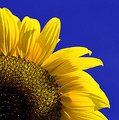
| 09/22/2006 04:15:45 PM | Take Your Pickby jimnessComment: very nice, but there's something odd going on at the edge of the petals and the sky. the colour is almost too intense; it begins to look fake. | | Photographer found comment helpful. |
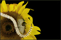
| 09/22/2006 04:14:51 PM | Sowing Seedsby cheegirlComment: a wonderful, witty idea. my only problem with it is the light onthe petals seems a bit flat, and detracts from the image. |
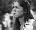
| 09/18/2006 07:07:08 PM | Smoking is Glamorousby CalliopeKelComment: wonderful image! compostion, tones, the lot. and funny to boot. well done! Message edited by author 2006-09-19 07:43:39. | | Photographer found comment helpful. |
| 09/17/2006 11:02:02 PM | Structureby CalliopeKelComment: I've been looking through your portfolio for a while now, and i kept on thinking - geez, her work reminds me of someone's, but i was always too lazy to go and check in my books. i finally did. sally mann. her haunting, slightly disturbing, beautiful shots of her children seem to have some of the same feelings as yours, especially those of holly.
beautiful work, all of them. tone, composition, lighting, feeling. just lovely, in a dark and brooding kind of way. thank you.
edit - can't type Message edited by author 2006-09-17 23:06:55. | | Photographer found comment helpful. |
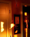
| 09/16/2006 12:49:20 PM | Through a window at 8:42PMby mattforbesComment: your riddle crit matt!
this is an interesting shot, that realy suffered because of it's poor resolution, i think.
i like your shadow, and the tones are lovely. the colours are gorgeous and very effective. however, i think the composition could be greatly improved. cropping the image so the door with sahdow and home sweet home sign are the only subjects would help; it's a little busy and messy.
of course, cropping it would run you afoul of futher reducing the resolution. so, the only thing i can say there is - shoot at the highest resolution possible on your camera (which is pretty damned high,, i jsut checked), or if it's texture you were going for, make it more obvious. with a sparser composition, it would have looke d a little less like poor resolution, it isn't. does that make any sense?
so - a good start to an image, with a few nice features. keep shooting - practice can make pretty damned good - if not perfect (perfection is boring, right?). |
| 09/15/2006 07:22:30 PM | Pastel pastelsby Gaby_GComment: Hi, I’m Christian, from the Critique Club.
This is a lovely image with crisp, clean colours. A lovely highly saturated pastel image. The lighting is excellent. The texture of the pastel flakes works very well, as does the tooth of the paper below. I like that the colours have blended on the paper to create that lovely soft grey you get with pastels.
The composition works well, with the lines of the pastels leading the eye into the powdered sticks in the centre. The contrast of the occupied space of the top and the empty space of the bottom right is very effective as well.
The only problem I see with the image is with the depth of field. I find it rather distracting that the blue pastel is so out of focus, and the red pastel is in quite sharp focus. I realise that when you’re dealing with macro like this, a shallow depth of field is unavoidable. I just wish it was even.
So, a very good image indeed, with just one little niggly crit. You definitely deserved your top 20 placement. Well done!
If you have any questions about this crit, please pm me. I hope it’s helpful for you1
Cheers,
C.
| | Photographer found comment helpful. |
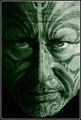
| 09/14/2006 08:57:22 AM | Maori Taneby lahulfmanComment: Critique Club
Hi, my name is Christian; I’m from the critique club, and WOOHOO! I love this image. As I said when I commented on it during voting. So...
The subject works very well, serious, beautiful, yet not threatening. Rather than a possible arrogance which could be shown in the face of a traditional warrior, there is instead dignity, wisdom and gravitas. A hint of sorrow?
The focus on the eyes is superb, with a detail and limpidity that make them seem truly alive.
The composition works very well; the tight crop really insisting we look into the subject’s eyes, making the connection. The lines of the tattoo bring you in and through to the eyes, on an unending loop. Which I’m sure was the original intent in traditional facework like this. The lines of the tattoo themselves are lovely, and they work in such harmony with his face.
The tones work well, a full tonal range, leaning toward the contrasty. Very nice indeed.
While some may have not agreed with the green cast, I find it quite effective. Despite his overwhelming humanity, the green does separate him, make him slightly otherworldly. Monumental.
Well done indeed. Would I change anything? No.
If you have any questions, please pm me.
Cheers,
C.
p.s. i gave you a 9 in voting Message edited by author 2006-09-14 19:52:32. | | Photographer found comment helpful. |
| 09/14/2006 08:33:16 AM | Bored (Different Processing)by tonyvComment: i really like this version; the crop and depth of tone work very well. i think if you had just a little detail on the eyes, it would bring it alive.
 maybe not this much. now that i look at it agian, i overdid it a bit, i think. i hope you don't mind me having a fiddle | | Photographer found comment helpful. |
| 09/13/2006 09:36:16 PM | Glassby TomH1000Comment: hello from the critique club
my name is christian, and i'm a memeber of the CC. if you have any questions about this critique, please pm me and i'll try to help with anything i can.
a very interesting image. techincally very good, with the receedihng lines of the glasses drawing you in. the texture and detail of the glass itself are well rendered too.
however, i find the colour on the background becomes overpowering and distracting. i think it may be the flatness and purity of the tone that works agains the image. with perhaps a bit more variation of tone in the background, it would bring the eye in to the glasses more, focus our attention. i also find the border very distracting to your image. it sets up an unpleasant dissonance, and actively draws the eye from your subject. lastly, i think the glasses could be improved by a little darker tones on some of the reflections. the midtones do tend to blur together.
so, a very nice image that, with a little work, could be outstanding. well done indeed.
if you have any qyestions about this crit, please pm me.
best wishes,
c. |
|
Showing 1391 - 1400 of ~1898 |
Home -
Challenges -
Community -
League -
Photos -
Cameras -
Lenses -
Learn -
Help -
Terms of Use -
Privacy -
Top ^
DPChallenge, and website content and design, Copyright © 2001-2026 Challenging Technologies, LLC.
All digital photo copyrights belong to the photographers and may not be used without permission.
Current Server Time: 06/16/2026 03:42:09 PM EDT.
|