| Image |
Comment |
| 02/12/2006 06:53:25 PM |
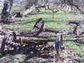
Broken Down with Age !!by mightythorComment: The image is very washed out - this can be fixed in an editing tool, but make sure your monitor is well calibrated first |
| 02/12/2006 06:51:25 PM |
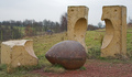
brake the mouldby alpharichComment: This has so much potential, but you have not given yourself even half a chance.
Lets look at the background - too much going on, too much detail. Stop down to f2.8 or f4 to throw all that background out of focus.
Next lets look at the light - bland and flat. Come back at dawn or dusk and get some sideways directional light to pick out the shapes.
Composition - the main object is placed dead centre, remember the rule of thirds and look for an angle where you can make use of it.
Last - that hint of blue keeps dragging my eye over the hill. Place your camera and viewpoint so that you do not have these distractions. Hide it behind one of the upright pieces. |
 Photographer found comment helpful. Photographer found comment helpful. |
| 02/12/2006 06:11:18 PM |
|
| Photographer found comment helpful. |
| 02/08/2006 12:29:02 AM |
|
| Photographer found comment helpful. |
| 02/07/2006 03:02:54 AM |
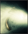
Space & Timeby hokieComment: Returning to bump this one up a little - like the way the watch face fades into the light. |
| 02/07/2006 03:02:12 AM |
color my worldby woodseyComment: OK - I voted this a 5!
For me the reasons it didn't get higher are, a) its a little bit of a tired theme, there are lots and lots of examples of this on DPC, which is not a problem except that many of the examples are much more vibrant and cleaner than this. b) the colors are dull and washed out, nothing really jumps off the screen. If you are going to repeat a formula then you have to take it one step further. Its fine to learn and practice, but your scores will reflect that. c) the border doesn't do much for me, but again thats personal taste.
All that being negative comment I do think you have had a reasonable attempt, with better lighting you might get a sharper and cleaner image. Boost the saturation in PS and you will be well on the way.
Hope you don't think I'm being too brutal |
| 02/07/2006 02:54:59 AM |
Color Burstby donnievComment: Nice pastel shades, nice structure, has leading lines, but I can't get excited about it. There is something missing, it needs another element, but I don't know what that is. |
| Photographer found comment helpful. |
| 02/07/2006 02:53:25 AM |
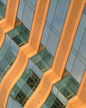
Desktop dramaby BrennanOBComment: Not sure what I'm looking at, which is what the challenge asked for ;-)
However there doesn't appear to be any structure to the image, or very little apart from the bold blocks of color. It's nice but I need more to make it claim those 6 points. |
| Photographer found comment helpful. |
| 02/07/2006 02:51:20 AM |
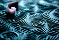
Waveby gurlwithapenComment: I quite like this image, but the one thing which kills it for me is the focus. You need to have that white swirl in focus, its the one element which the eye recognises as breaking the pattern but being out of focus is 'uncomfortable'. |
| Photographer found comment helpful. |
| 02/07/2006 02:48:53 AM |
KCRC3by banmornComment: Very graphic. I expected to see more of these in the challenge. This a a very good example of the genre. |
| Photographer found comment helpful. |
Home -
Challenges -
Community -
League -
Photos -
Cameras -
Lenses -
Learn -
Help -
Terms of Use -
Privacy -
Top ^
DPChallenge, and website content and design, Copyright © 2001-2026 Challenging Technologies, LLC.
All digital photo copyrights belong to the photographers and may not be used without permission.
Current Server Time: 06/10/2026 01:12:09 AM EDT.