| Image |
Comment |
| 11/13/2006 03:43:51 PM |
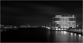
City Lightsby silverscreenComment: Very geometric. Its not too pretty but I don't mind that at all. My eyes are immediately drawn to that cube, and just won't go anywhere else in this image. I like it a lot. |
 Photographer found comment helpful. Photographer found comment helpful. |
| 11/13/2006 03:41:51 PM |
|
| Photographer found comment helpful. |
| 11/13/2006 03:40:48 PM |
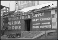
The Feed Storeby DrKDBComment: Lacking in any great tonal range, feels washed out. Also the composition needs a little work, with the door being moved left or right, as opposed to central |
| Photographer found comment helpful. |
| 11/13/2006 03:39:41 PM |
GOT MILK?by magenmarieComment: Different topic, feels a little grey, perhaps a little more contrast, especially on the milk and bubbles |
| Photographer found comment helpful. |
| 11/13/2006 03:38:53 PM |
|
| Photographer found comment helpful. |
| 11/13/2006 03:38:03 PM |
Venetian Ceilingby scarbrdComment: Beautiful detail and tonal range. The centre line of the dome is just slightly off to the right, but thats only a minor point |
| Photographer found comment helpful. |
| 11/13/2006 03:37:11 PM |
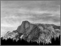
Half Domeby tfarrell23Comment: Classic subject, great lighting, possibly just a tad more contrast on the mountain itself |
| Photographer found comment helpful. |
| 11/13/2006 03:35:58 PM |
|
| Photographer found comment helpful. |
| 11/13/2006 03:35:24 PM |
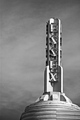
The Essexby jerseyjimComment: Usually I don't like images where the bottom of a building is croped out. This is an example which breaks the rule. Nicely 'grounded' on that plinth the detail in the tower is excellent. |
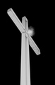
| 11/13/2006 03:34:02 PM |
Light of the Worldby SheryllComment: The image has nothing to recommend it as an image and relies on its symbolism for impact. Unfortunately religeous icons never really do much for me. |
| Photographer found comment helpful. |
Home -
Challenges -
Community -
League -
Photos -
Cameras -
Lenses -
Learn -
Help -
Terms of Use -
Privacy -
Top ^
DPChallenge, and website content and design, Copyright © 2001-2026 Challenging Technologies, LLC.
All digital photo copyrights belong to the photographers and may not be used without permission.
Current Server Time: 07/18/2026 09:08:07 AM EDT.