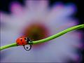
DPChallenge: A Digital Photography Contest You are not logged in. (log in or register
 
Browse Settings
Currently viewing:
Registered UserFalc

Show comments:

Per page:

Order:

Comments:


Comments Made by Falc
Pages:   ... [129] [130] [131] [132] [133] [134] [135] ... [230]
Showing 1311 - 1320 of ~2300
Image Comment
Dark Days
07/12/2005 01:16:58 PM
Dark Days
by tristalisk

Comment:
BW Mentor Group

Hi Tristalisk,
Now this one is my sort of image, I love b/w landscapes and this is well up there with the best. The sky especially is very very nice, Lots of texture aith all the gradients and shapes pulling the eye into the highlight where the sun pokes through the cloud. The highlight is nicely placed on the third line, maybe the horizon is just a tad high, but nothing too wrong with it. The reflections too carry the tones up and left towards thos highlights.

Theres not much I can offer in terms of making this much better, perhaps just cloning out those bouys in the water, but hey nothing serious.

Falc
Photographer found comment helpful.
Three in One Macro
07/12/2005 06:52:21 AM
Three in One Macro1st Place
by Falc

Comment:
Originally posted by kiwinick:

Same ladybird same leaf?


No several different ladybirds and a different leaf, though from the same plant ;-)
Intimate Setting
07/12/2005 05:34:30 AM
Intimate Setting
by aboutimage

Comment:
B/W Mentor Group.

Still life is not one of my strong points, in fact its one of my pet hates - sorry!!

However, having said that lets have a real look at this image.
WIne, rose, small intimate table, all suggests romance to me, but look at the tonal range you have used. Stark contrasts with very little between shadow and highlight. For me this subject calls for soft easy flowing tones, almost high-key, with parts overblown to let the imagination fill in the blanks. OK its a cliche I know, but maybe it would work ;-)

Hope that doesn't sound too negative. The image is anice enough image but to take it to the next level it needs mmore atmosphere, and a different conversion might add that little something.
Photographer found comment helpful.
coney island slalom
07/12/2005 05:26:33 AM
coney island slalom
by muckpond

Comment:
B/W Mentor Group.

OK I'm going to ignore the tilt, its been noticed and could be fixed very easily.

What I find intiguing is the tonal differences here. The barrels are black, deep black and provide a lead all the way down through the image. The rider is also black so the eye understands that there is some linkage between him and the barrels. But then you start to absorb the rest of the image an dit fades gloriously frm left to right. The tones get whiter as it approaches the building on the right. I like that aspect more and more as I look at the image, it too adds to the pull on the eye from left to right.

I'm going to guess that you used a ND grad filter because the lampost gains darkness as it gains height and there is some added definition in the clouds. Tonal range feels right apart from the lamps

Now to be honest I hadn't seen the overlap of the rider and the couple on the bench, but having just read Kaveys comments that now jarrs quite badly and would have been better if you had stepped two paces left.
Old Panes
07/11/2005 11:28:07 PM
Old Panes
by Kavey

Comment:
B/W Mentor Group.

Hi Kavey,
I think you are correct in the fact that this is a classic subject for monochrome, the lines are stark and contrast very well against that textured glass. Its the lines which provide the structure, whilst the whites and greys provide the detailed infill, and its these areas which the eye drops onto and explores.

I can't decide whether I would like to bump the contrast in those swirls and textures in the window, I'd be scared of losing too much detail. If you look through the window at the left hand side you can see that there is no grey in that section becasue of the window jamb on the outside. That area would need some special treatment to not simply blow out.

Do you know what this image calls out for?
Something in silhouette on the window cill at the right hand side. A candle maybe, just something simpe to balance those textures.

Falc
Photographer found comment helpful.
Three in One Macro
07/11/2005 10:04:58 AM
Three in One Macro1st Place
by Falc

Comment:
WOW, what can I say, thanks to you all including yurasocolov. I do appreciate all your comments. The image is not very imaginative, I new there would be lots of bugs, lots of water droplets and lots of flowers and to get points over any of these the winner would have to be brilliant at any one of these. I knew that by combining these themes that there were extra marks to be gained and I had seen something similar a long time back on some other site (can't find it now though). I did really enjoy experimenting with this and building a small 'set' so achieve the effects.

So for those of you who asked about the details here is how:

Equipment:
1 small cardboard box - approx 9inches across.
1 Sheet dark green card for backdrop, applied to inside of box
1 spiral reed pushed through holes in side of box - used spiral reed in order to stop the water droplet running away
1 white/pink/purple daisy like flower - pushed through a hole in back of box
several willing and unwilling ladybirds
1 childs paintbrush - to coax ladybird into walking the plank
1 syringe to add water after each retry
camera - 10D with 100mm f2.8 macro lens
canon ex550 flash with remote trigger
tripod

OK so with the reed and the flower set up I added a drop of water, then pushed/pulled the flower until I got the right amount of blur in the background whilst manually focussing on the water drop.

Once this was set the it was a case of ladybird wrangling with the pant brush. I found that they didn't like to pass the water droplet and would either turn round or jump off at that point. I know I had about 7 or 8 bugs and only got 3 or 4 decent shots before I ran out.

I also tried the same shot with a small froglet, but the dof was too short to get his nose and feet in focus, so I went back to the ladybirds. I also had an attempt at a damsel fly version, but he wasn't to sure about signing the model release so I had to let him go.

All done in a very enjoyable afternoon sat in the garden.
An Obsolete Way of Life
07/10/2005 04:22:29 PM
An Obsolete Way of Life
by rlinn3

Comment:
OH I just found out this got DQ'd. Thats a real bummer.
I voted this one for blue ribbon, its simplicity and composition just hit the nail on the head.
Shame, hope we see more of your work
Photographer found comment helpful.
Circles aROUND the House
07/06/2005 03:17:57 PM
Circles aROUND the House
by DaMoNarch

Comment:
OMG coins and CD's, I'm sorry but this is just boring. I know thats rude but please give the voters something interesting to look at. Do us the honour of putting a little thought into your submissin and not just finding the first three round things and taking a photo. DPC is about challenging photography not a scavenger hunt.
Ambience
07/06/2005 03:11:42 PM
Ambience
by sprite777

Comment:
nice, but a bit over the top with neat image of gaussian blur for me
Photographer found comment helpful.
Going Round In Circles Just Before Company Arrives
07/06/2005 03:10:40 PM
Going Round In Circles Just Before Company Arrives
by Linden

Comment:
the sky is very blown out whilst the grass is too dark for me
Photographer found comment helpful.
Pages:   ... [129] [130] [131] [132] [133] [134] [135] ... [230]
Showing 1311 - 1320 of ~2300


Home - Challenges - Community - League - Photos - Cameras - Lenses - Learn - Help - Terms of Use - Privacy - Top ^
DPChallenge, and website content and design, Copyright © 2001-2025 Challenging Technologies, LLC.
All digital photo copyrights belong to the photographers and may not be used without permission.
Current Server Time: 09/15/2025 07:23:30 AM EDT.