| Image |
Comment |
| 11/05/2006 01:12:31 AM |
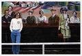
Self Portraitby RudyC310Comment: Something about this is truly amazing... I can't really define it, but it is awesome. |
| 11/05/2006 01:11:37 AM |
|
 Photographer found comment helpful. Photographer found comment helpful. |
| 11/05/2006 01:09:48 AM |
|
| Photographer found comment helpful. |
| 11/05/2006 01:08:56 AM |
|
| Photographer found comment helpful. |
| 11/05/2006 01:08:43 AM |
|
| Photographer found comment helpful. |
| 11/05/2006 01:07:29 AM |
|
| Photographer found comment helpful. |
| 11/05/2006 01:06:56 AM |
|
| Photographer found comment helpful. |
| 11/05/2006 01:05:45 AM |
|
| Photographer found comment helpful. |
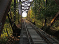
| 11/03/2006 01:20:54 AM |
Built in 1906by jjstager2Comment: *Critique Club*
As I touched on before, this shot does feel like it is leaning to the right. Maybe rotating and cropping would help, but I feel like it may have been better to take the shot with the camera at a more straight-on angle (in the center of the tracks). However, that would produce a composition that is more "standard" - and while the leaning is a bit distracting, I do love how it makes the composition dynamic and unique.
Graffiti is a bit distracting (mainly I am talking about the part on the left). I like it for the character it shows but in advanced editing maybe a bit of burning could help it stand out less. Sharpening was done well, as was the adjustments to shadows and highlights. I love how there is a lot of detail in this shot but it still does not feel too busy/visually confusing.
All in all, an interesting shot that is nice to look at and portrays the challenge very well. |
| Photographer found comment helpful. |
| 11/01/2006 04:09:44 PM |
SPIKE: Strong & Stableby 777STANComment: *Critique Club*
The concept is wonderful - as a previous comment stated, it was refreshing to see this interesting take on the challenge! Your post processing definitely seems to be effective - good contrast and sharpening. I particularly like the composition and depth of focus here. I also like how, while the spike and the background are pretty much the same color, they do stand out from one another.
The thing that, in my opinion, hurt the shot the most is the harsh shadow. It just attracts the eye a bit too much, so shooting at a different time of day or adding more lighting may have helped. Another thing that may have looked nicer is if the white spots (kind of in a parallel line to the black line) were removed either before the shot or in post processing. However, that is very nitpicky and I definitely didn't notice any problems with that at first glance. |
| Photographer found comment helpful. |
Home -
Challenges -
Community -
League -
Photos -
Cameras -
Lenses -
Learn -
Help -
Terms of Use -
Privacy -
Top ^
DPChallenge, and website content and design, Copyright © 2001-2026 Challenging Technologies, LLC.
All digital photo copyrights belong to the photographers and may not be used without permission.
Current Server Time: 07/23/2026 12:36:42 PM EDT.