| Image |
Comment |
| 08/10/2006 11:02:28 AM |
|
 Photographer found comment helpful. Photographer found comment helpful. |
| 08/09/2006 09:01:51 AM |
|
| Photographer found comment helpful. |
| 08/08/2006 02:16:07 PM |
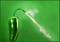
Jalapeno Popperby cutlassdude70Comment: ---Greetings from the Critique Club!---
I think I've critiqued one of yours already!
First impression - good idea, but looks over processed.
I like the idea of giving the viewer something to contemplate besides just color on color. Good job there.
The reflections on the jalepeno are a bit distracting. The halo around the pepper gives it that over processed look IMO.
The composition is great. The eye first goes to the pepper then up and over via the fuse to the fire. Nicely done.
The top of the fuse loses focus a bit. This probably cost you some points with the voters. The neon green border probably cost you a point or 2 as well.
Anytime you get a 6+ here you've done well. Extra points from me for creativity.
I hope this was helpful. Please contact me if you have any questions.
David |
| Photographer found comment helpful. |
| 08/08/2006 10:52:04 AM |
Boiler Beachby FromacComment: Nice shot, but I've noticed on this one and another that your horizzons are not level. It's OK to tilt the horizon if it adds to the photo. If you do tilt you should tilt so that it is obviously intentional.
You can straighten the horizons in most phot editing software.
On the composition, as with tilted horizons, you also want to be careful about having the horizon run through the middle of the photograph. Usually, the image will be better if the horizon is 1/3 from the bottom or 1/3 from the top. This image is a good example of this. This is part of "The Rule of Thirds" compostion. Search on it
These are both guidelines, not rules per se. Compose how you want, but be aware that there are copmostion guidelines that do help.
Good luck! |
| Photographer found comment helpful. |
| 08/04/2006 05:12:57 PM |
|
| Photographer found comment helpful. |
| 08/03/2006 05:12:41 PM |
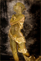
Goldby thomaspeopleComment: ---Greetings from the Critique Club!---
First impression - Neat idea!
This is a great idea for the challenge. I commend your creativity and executing your idea.
The composition is good, as is the lighting.
To say what would have made this score better, I think it needs some sort of context. With the stark white background it appears to be floating in space. I think if you would have set this up with a bowl of dip, or used a table as the background, you might have done a bit better. 5.58 is a good score, particularly with the competition here at DPC. Put as much thought into the setting as you did the idea and your score would have been high, IMO.
I hope this was helpful. Feel free to contact me if you have any questions.
David
|
| Photographer found comment helpful. |
| 08/01/2006 10:21:36 PM |
|
| Photographer found comment helpful. |
| 07/31/2006 12:36:07 PM |
The Midas Touchby idnicComment: I had this one finishing much higher. Nice shot, good set up, and well executed! |
| Photographer found comment helpful. |
| 07/30/2006 03:44:01 PM |
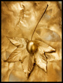
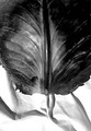
Cabbageby edc1Comment: ---Greetings from the Critique Club!---
First impression - Interesting shot, I'd like to know more about the setup and post processing.
The contrast between the leaf and backgroud (cloth?) is nice. Black and white was a good choice but the image appears over processed to me.
The texture at the base of the leaf comes across strong but loses clarity as the eye moves up the leaf. The light coming from behind adds to the dramic effect.
Over all a good effort, without knowing more about the intent or the processing steps, it is difficult to make suggestions. In the future, if you request a critique please give more information.
I hope this was helpful. Feel free to contact meif you have any questions.
David
|
| 07/30/2006 03:34:11 PM |
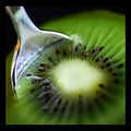
Extraction Of An Abstraction by hotpastaComment: ---Greetings from the Critique Club!---
First impression - awesome shot but not really an abstract
IMO, being able to recognize this as a kiwi fruit right off tells be this is not an abstract. I know not all DPC share that opinion and the overall voting reflects that.
From a photographic standpoint, this image has a lot going for it. The composition is particularly well done. The eye travels down the spoon to the spread of seeds in the fruit then around the green letting the view take in the whole image.
I feel a real chill to the spoon and the fruit making the image even more intriguing. The line of focus in the lower left corner looks a little like it was selected and blurred in post processing. Hard to tell from your notes. If this is the case, I would recommend a smoother transition (more feathering) between the 2 fields.
The border is too wide as well. It takes attention away from the strong image.
Congratulations on your ribbon and execution of an exceptional macro!
I hope this was helpful. Feel free to contact me if you have any questions.
David
|
| Photographer found comment helpful. |
Home -
Challenges -
Community -
League -
Photos -
Cameras -
Lenses -
Learn -
Help -
Terms of Use -
Privacy -
Top ^
DPChallenge, and website content and design, Copyright © 2001-2026 Challenging Technologies, LLC.
All digital photo copyrights belong to the photographers and may not be used without permission.
Current Server Time: 06/12/2026 10:22:27 PM EDT.