| Image |
Comment |
| 07/27/2006 04:50:35 PM |
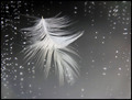
The Thoughtby stare_at_the_sunComment: Very cool. I really like the placement and the angle of the feather and the reflection. I think I would like it better nice and clean (no little bits of white stuff). |
 Photographer found comment helpful. Photographer found comment helpful. |
| 07/27/2006 04:48:30 PM |
|
| Photographer found comment helpful. |
| 07/27/2006 04:37:37 PM |
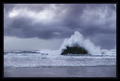
Violent Eruptionby GIS_boyComment: While there is a lot of color in this photo, it still feels like it's B/W. Great work! |
| Photographer found comment helpful. |
| 07/27/2006 04:36:32 PM |
Recessby ltlmschrisssComment: Fabulous. Love the DOF. It creates a really cool effect in the 3. Great emotion here as well. It takes me back to those good ol' days. |
| Photographer found comment helpful. |
| 07/27/2006 04:30:10 PM |
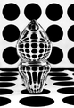
Polka Dotsby Sunshine86Comment: Some fun refractions in that crazy glass thing. I think I personally would like this more with a really close crop on the thing making it more abstract. |
| Photographer found comment helpful. |
| 07/27/2006 04:28:59 PM |
Smudgeby WobbleComment: Cute kitty. I like the fairly shallow DOF, but I would rather not be able to see the edge of the towel at the top. Focus seems a bit soft as well. Looks like (s)he is enjoying quite the nap! |
| Photographer found comment helpful. |
| 07/27/2006 04:27:33 PM |
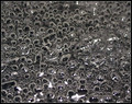
Sweet Bubblesby Dirt_DiverComment: Pretty cool looking, and I love a good abstract. It does seem a bit busy, though. Maybe fewer little bubbles and one or two larger ones? |
| Photographer found comment helpful. |
| 07/27/2006 04:26:27 PM |
NASCARby dphotogurlComment: Nice idea. The sign looks great against the wispy white clouds in the sky (especially with the slight blue tint to the sign.) The only thing I don't like would be the fingers just barely visible under the sign. |
| Photographer found comment helpful. |
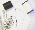
| 07/27/2006 04:24:13 PM |
Tie one onby tdaughertyComment: Nice title. This is a cool idea, but the technicals seem to be lacking a bit. The white spool is quite blown out, but it could really still use some contrast. Seems a bit overexposed. |
| Photographer found comment helpful. |
| 07/27/2006 04:22:43 PM |
The pianoby rapidComment: I like the angle you used here, but it's very grainy/noisy in the blacks. |
| Photographer found comment helpful. |
Home -
Challenges -
Community -
League -
Photos -
Cameras -
Lenses -
Learn -
Help -
Terms of Use -
Privacy -
Top ^
DPChallenge, and website content and design, Copyright © 2001-2026 Challenging Technologies, LLC.
All digital photo copyrights belong to the photographers and may not be used without permission.
Current Server Time: 06/12/2026 08:47:03 AM EDT.